Product Design Lead, 2023 - 2024. I oversaw and led the UX at Vouch, spearheading design from discovery to implementation
Background
Vouch is a platform that makes it easy collect, create and share short authentic videos.
The platform has evolved over time to go from sales and marketing to now working primarily within the Employer Brand space.
We have tools in place to let our customers setup outbound video requests, a library to manage their content and then a lightweight video editor to assemble outbound videos with templated assets.
I joined Vouch with a keen interest to start working within a Tech Startup and also for the chance to work in the video space. This medium was of particular interest because on the side I’m also a short filmmaker that has made several films. Upon joining Vouch in 2023, my first task was to understand the platform and start assembling a new design processes and rituals. The role required a strong fluency in each area of the UCD process as I was taking over the roles and responsibilities of 1 senior design lead and 2 junior product designer before me. As such I wanted to ensure the role of design fit and operated within the role of the company efficiently. Being a startup with 20 employees as well meant establishing those relation early on were key to success. I had in-depth talks with 8 engineers and 2 product managers to understand their working and operating model with Design in the past.
Through these conversations I identified themes and needs across the other teams for open conversation and for a need to think leanly and agile across our platform. I created a design shareout for the discovery and framing process that to align to this operating rhythm to the needs of the team. Establishing this early helped ensure that design could rally everyone to the same understanding of the problem beings solved and there could be checkpoints along the way to ensure collective buy-in. Being a small design element in a fast moving team meant ensuring my time was used most efficiently it would be.
Information Architecture and Heuristic Evaluation
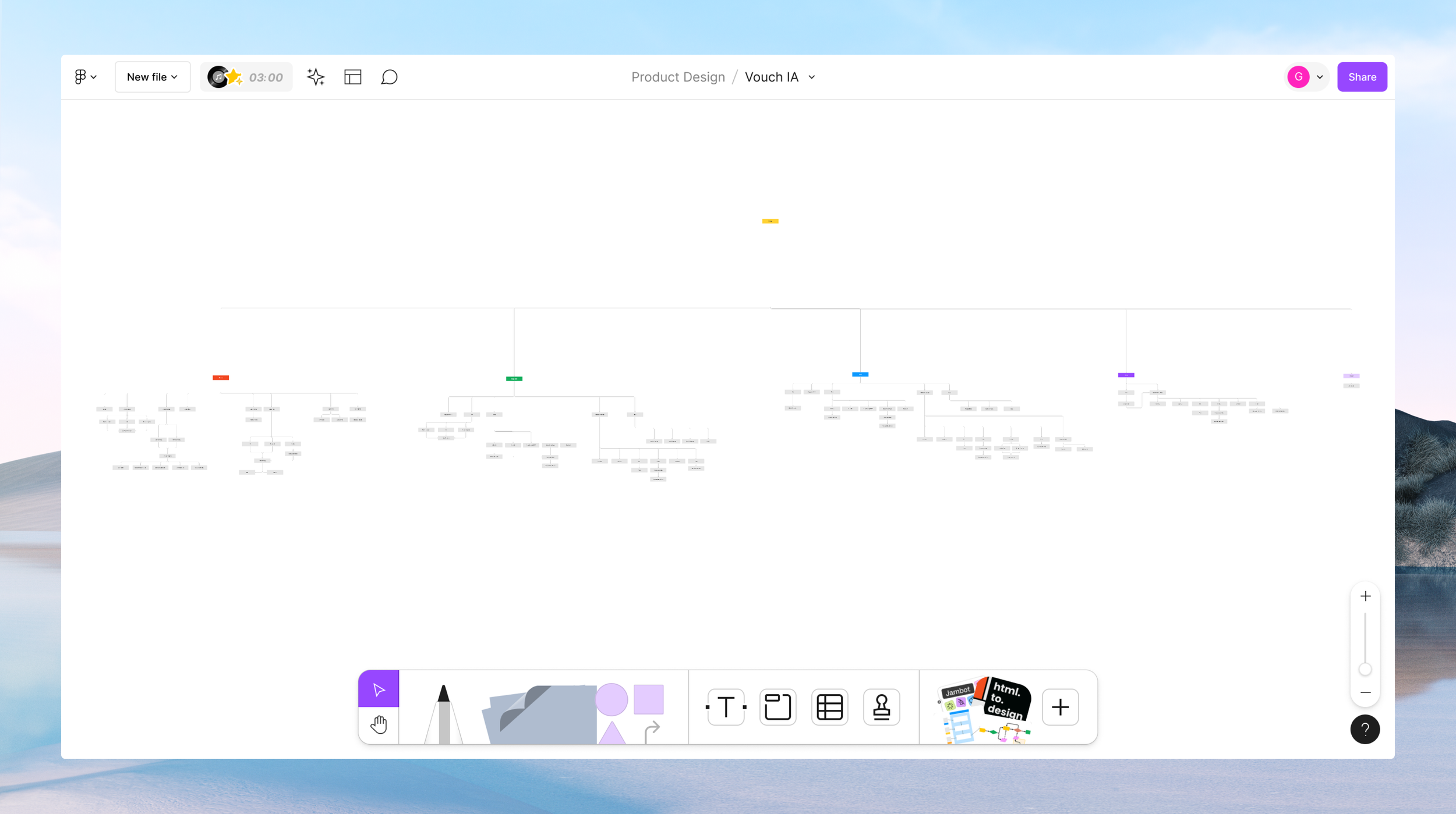
To better grasp the extent of Vouch’s video platform I mapped out the various capabilities of our site. As several new features had been released over the year and in between design elements coming and going, a new map was needed to list visually all of our features and services. This involved thorough dog-fooding of the product and in turn also began to bring to light any usability considerations to address. The challenge inititally that could be seen is the myriad of features shipped overtime with either no longer apt use cases or a need to be reinvested in to bring up to speed with user needs and our customer focus.
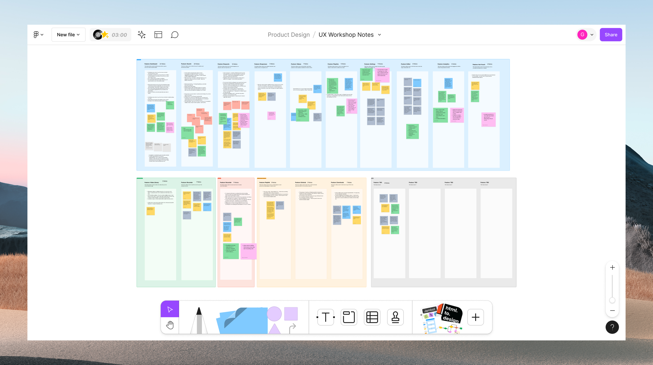
A follow on usability workshop was held across the internal teams to highlight issues that they themselves see everyday and or have heard from customers. A general trend was in general for main core flows to be streamlined (eg, fewer clicks and layers in), navigation to be simpler and broadly for features to be updated to the current new customer focus. Below, I provide an in-depth breakdown of each feature from those workshops, along with prevalent themes that emerged from each feature. In total there were approximately ~ 151 feedback notes for all the 15 features reviewed. An individual feedback note being defined as an individual sticky and or bullet point within each feature column where all notes were listed.
UX Workshops + New Project Kickoffs
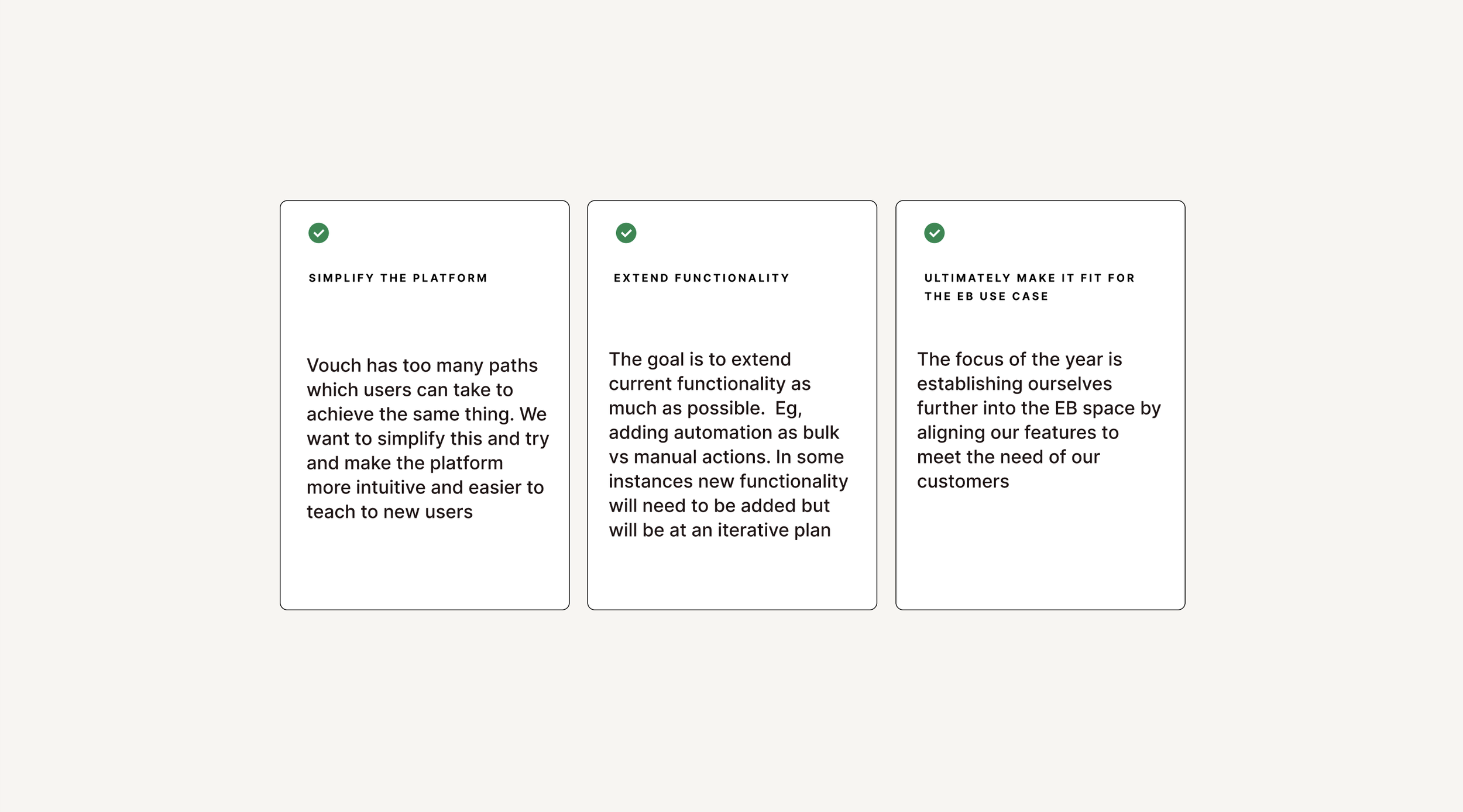
Around this time Vouch kicked off a project to revamp the platforms core features. Across the whole platform several themes themes spotlighted for universal usability trends. Users express significant challenges with navigation and visibility across different sections of the platform. There's a consistent desire for easier access to global settings, integrations, and key functionalities, as well as clearer guidance on how to use various features. Improved workflows, more intuitive action buttons, and enhanced overall user experience are crucial to reduce confusion. Users also highlight the need for better organization and management of content, such as requests, responses, videos, and playlists, suggesting enhanced filtering, sorting, and grouping options to improve content discoverability and usability.
Additionally, users seek features more aligned with their specific needs and workflows, emphasizing the importance of customization options. Performance issues, including slow loading times and cumbersome workflows, highlight the need for optimizing the platform for efficiency and responsiveness. Integration and collaboration features are also crucial, facilitating communication and teamwork. Users request more robust editing and recording tools, including options for splitting, editing transcripts, changing thumbnails, and simplifying the recording process. Finally, there's a strong call for consistency in UI, workflows, and functionalities across the platform to create a more cohesive and efficient user experience, with fewer clicks and more linear processes.
New Customer Market
Vouch was going through a series of transitions to try and find the right market fit from when I joined. Vouch originally was focused on employee advocacy, an easy way for teams to use video to ‘Vouch’ for another’s team. As customers needs evolved so did the market fit. After several explorations into the business and sales use cases Vouch eventually landed on supporting companies that work within Employer Brand (EB) . EB involves cultivating a positive image and distinct identity in the job market to attract talent. The primary user personas within the EB function are Talent Attraction (TA), and Talent Acquisition (TQ).
Talent Attraction professionals align recruitment strategies with the business's vision and collaborate with leaders to drive hiring and retention efforts. They tailor branding initiatives, develop engaging content, and manage a library of resources. Challenges include measuring the impact of employer branding efforts and managing competing content requests. Employer Brand professionals build and maintain the company's brand identity. They communicate the company culture through brand assets and video creation, collaborating with Talent Attraction and Creative Departments. Challenges include adjusting creative content to shifting strategies and quantifying the impact of branding efforts.
UX Focus - Improved Video Editor
Collectively with the usability evaluation done and along with customer feedback there was a business directed a roadmap of major improvements was put into place. Themes and specific usability challenges emerged from these conversations and efforts and priority workshop was run to decide which features would have the biggest impact and elevation to the user experience. From there it was decided by Product and the Business to focus is of the Video Editor. Originally as a video platform the goal had been to have a lightweight editor where one could stitch together videos. This limited editing experience became a point of friction as our customer base evolved to be those with an expanded need of capabilities to do thing like splitting clips, using video templates and more.
Video Editor Starting Point
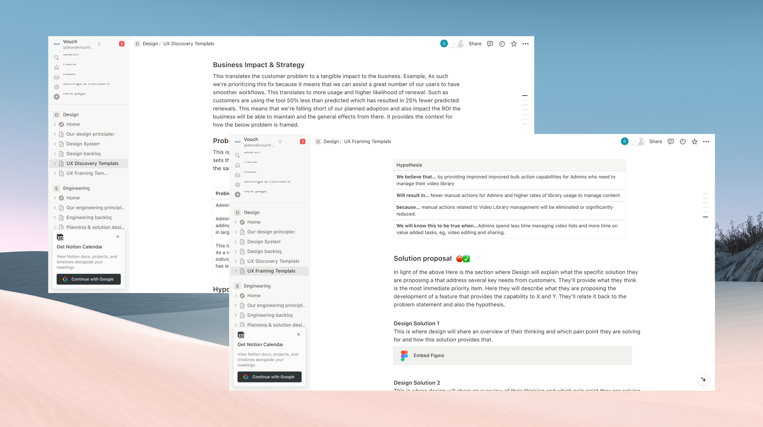
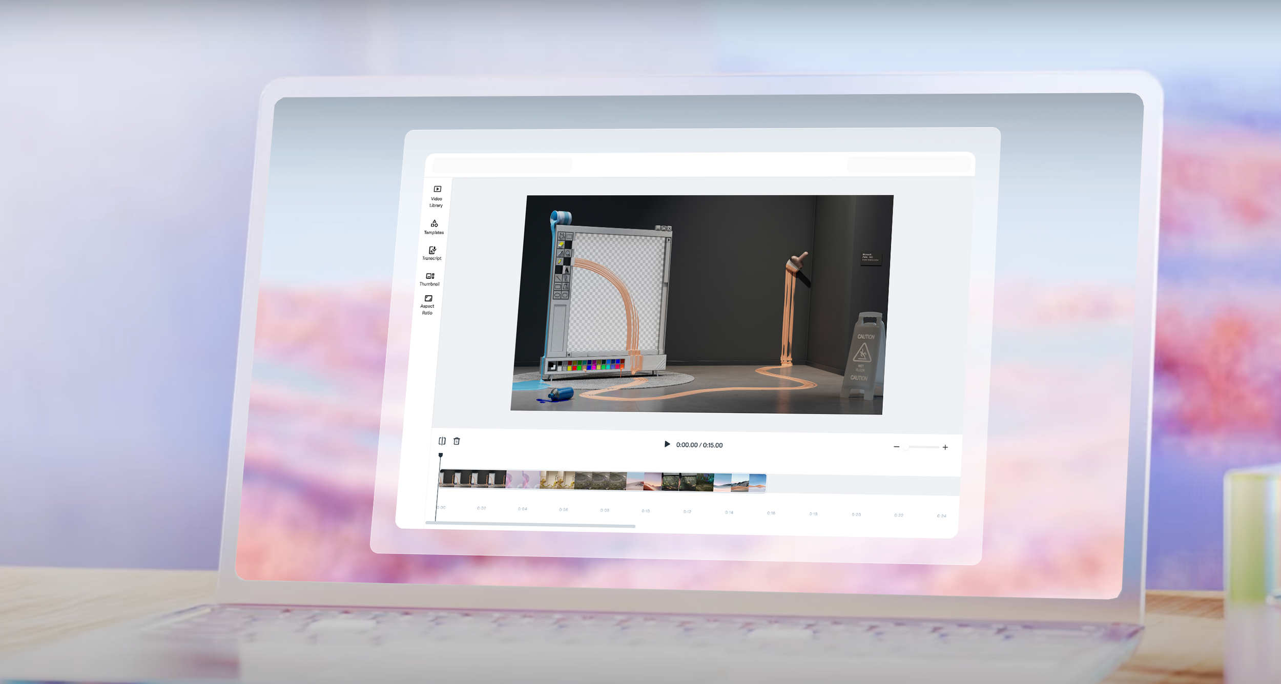
This is a walkthrough of the new Video Editor I worked on at Vouch. This new editing tool is a pivotal initiative aimed at significantly enhancing the platform’s video editing capabilities. Originally our Video editor was called Playlists and it was intended to be a lightweight way for you to stitch together several videos to share to others with minimal editing. However as our product has grown, so have the needs of our users evolved to need more advanced functionality to take full use of our platform. Our users being Employer Brand (EB) professionals who heavily rely on robust and intuitive video editing tools to support their branding and recruitment efforts.
Problem Context
The current state of Video editor within our platform revealed a lack of clarity among users regarding their purpose and optimal usage from customer conversations. Users grapple with understanding when and why they should utilize our video editor as its form and function hasn’t developed much beyond it’s initial use case as a way to stitch together videos. As a result, a significant number of users capture and gather content on our platform and then go offline to apply the edits they need. This happens because users do not have the capability to splice and or trim their videos properly due to the limited functionality within the tool. These are essential capabilities for any streamlined video editor.
Users face several challenges with our video editor, including purpose ambiguity, integration complexity, and navigation confusion. They lack a clear understanding of how the video editor fits into their workflows and the specific scenarios in which it should be used. Additionally, users struggle to grasp how Playlists interact with other platform processes, such as content sharing, due to the absence of clear guidelines. This hinders the seamless integration of Playlists into their tasks, causing frustration and inefficiency.
Furthermore, users often get lost in navigation when performing actions like editing or creating clips. There's also a lack of clarity on where to view and perform actions on responses, which adds to their confusion. The analytics representation within the platform needs to be clearer to enhance user understanding. Users are also uncertain that the video editor allows for editing multiple videos at once, and the sharing options are not prominent enough for better utilization of videos. Improving these areas is crucial for enhancing user experience and ensuring the video editor is effectively integrated into their workflows.
Success Measures
To enhance user engagement, it is crucial to monitor the percentage of active users who access the Video Editor regularly, aiming to increase this from the current 40% to 90%. Additionally, tracking the average session duration can provide insights into user engagement, with longer sessions indicating higher engagement. For new user onboarding, measuring the percentage of new users who explore and utilize the Video Editor shortly after signing up is essential. A successful onboarding process should lead to increased feature adoption, which can be further analyzed by examining the frequency with which users engage with the Video Editor, indicating its successful integration into their workflows.
Content creation volume is another key metric. Quantifying the number of videos created using the Video Editor and setting targets for increased content production can drive improvements. Specifically, tracking the usage of Playlists within the Video Editor and aiming for a substantial rise in Playlist creation can provide additional insights. By understanding how frequently users create content and use Playlists, we can better assess the tool's effectiveness and identify areas for enhancement to boost productivity and satisfaction.
To gauge user satisfaction, regular collection of user feedback on the Video Editor’s usability, features, and overall satisfaction is important. High satisfaction scores indicate successful adoption and highlight areas where the user experience is positive. Assessing the Net Promoter Score (NPS) can further reflect the likelihood of users recommending the Video Editor to others. A positive NPS signifies successful adoption and suggests that users are not only satisfied but also enthusiastic about the tool, further validating its value and functionality.
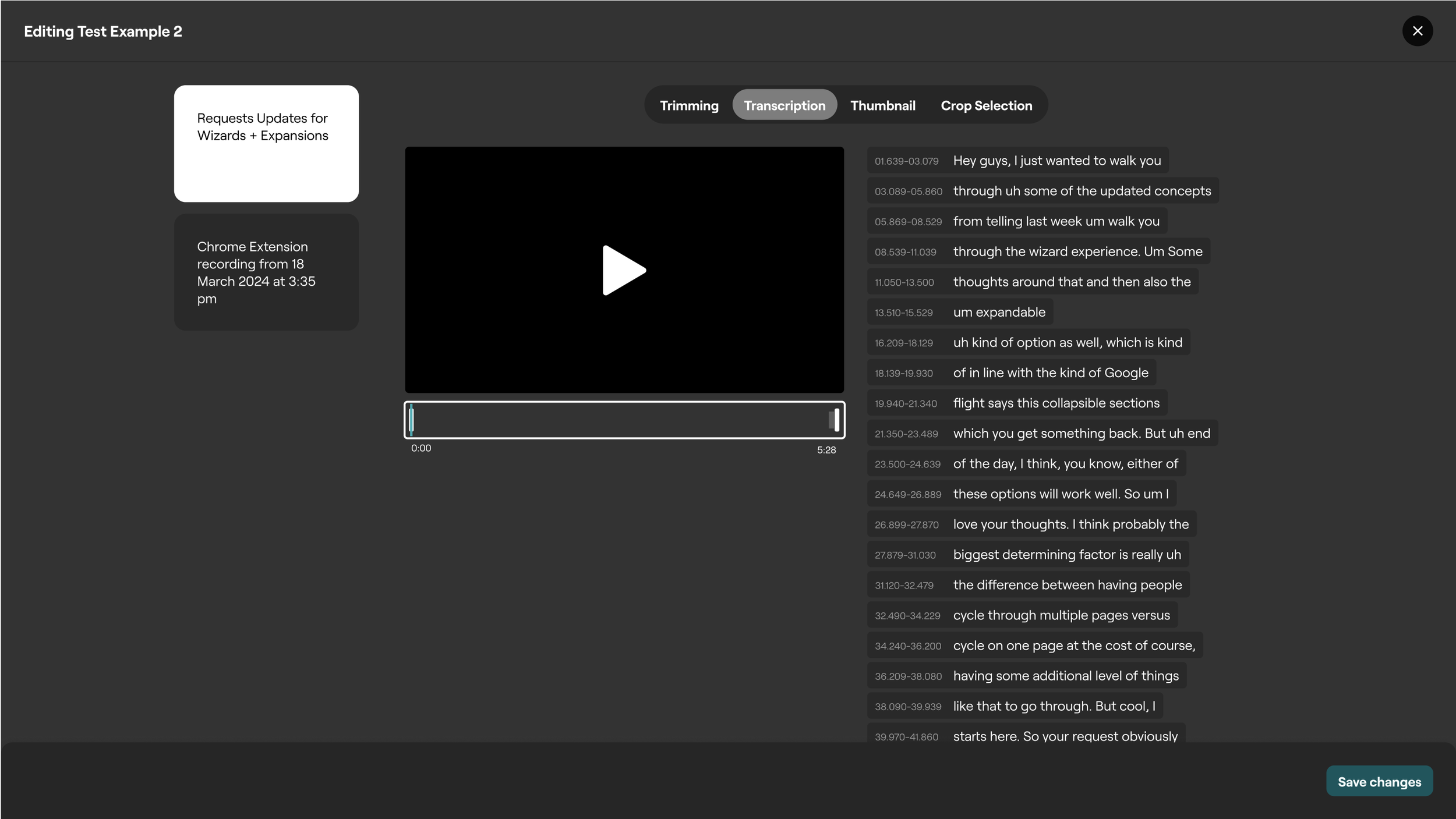
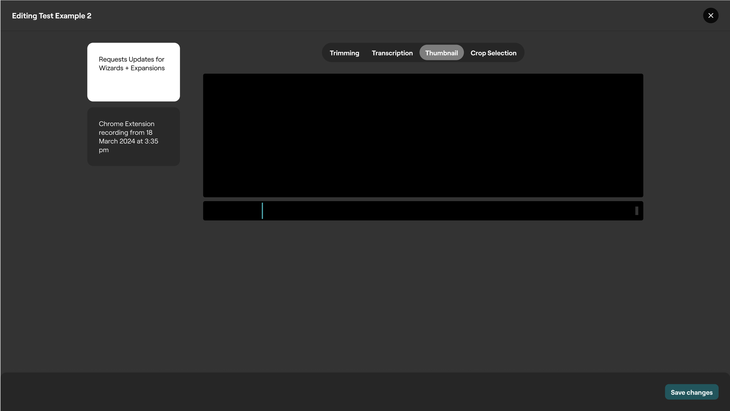
Current Video Editor (Playlist Editor)
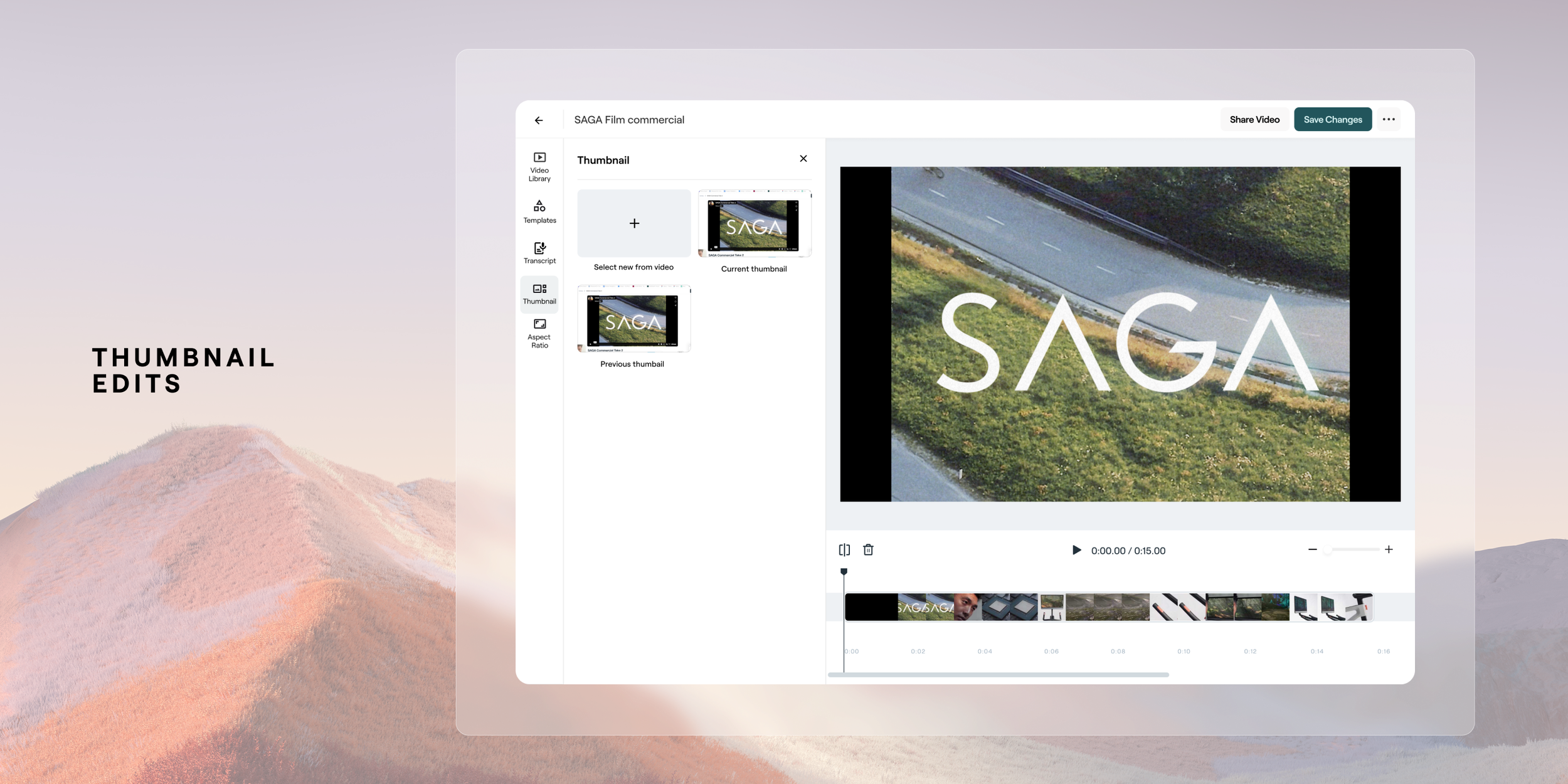
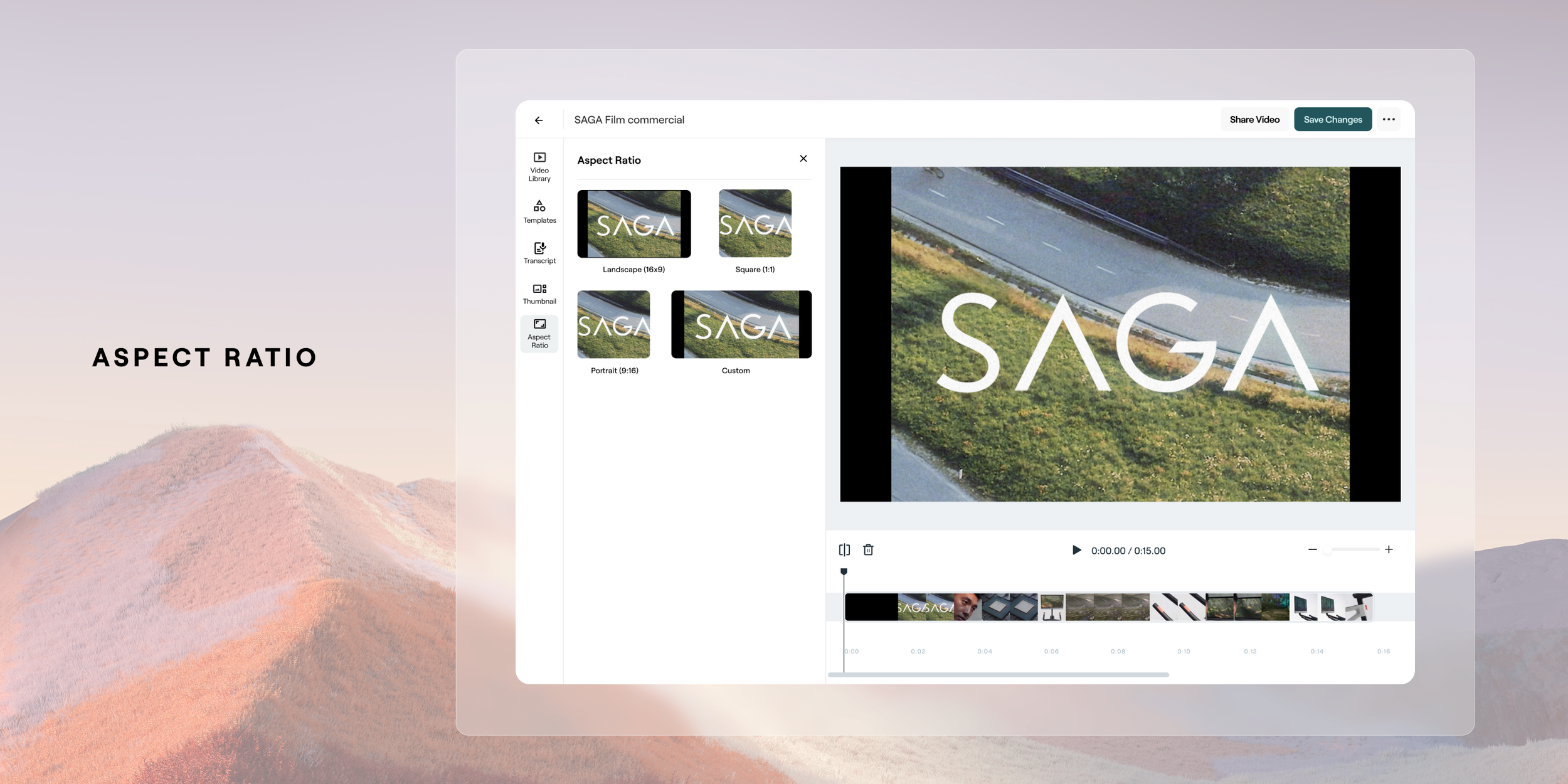
The previous tool for video editor was deisgned as a lightweight way to stitch together videos. It was also more aligned to a telempropmpter way of cycling through videos as most original content was intended to be from video requests for teams/individuals to connect. The capabilities within the tool include Trimming, which is where you can lengthen and shorten a clips length. Next there’s Transcription, which is where a user would like to remove um’s etc from a speech transcript. Next is Thumbnail where a user can select what they want the preview frame to be for viewers. Lastly we have crop selection which is where a user can adjust the aspect ratio output of the video.
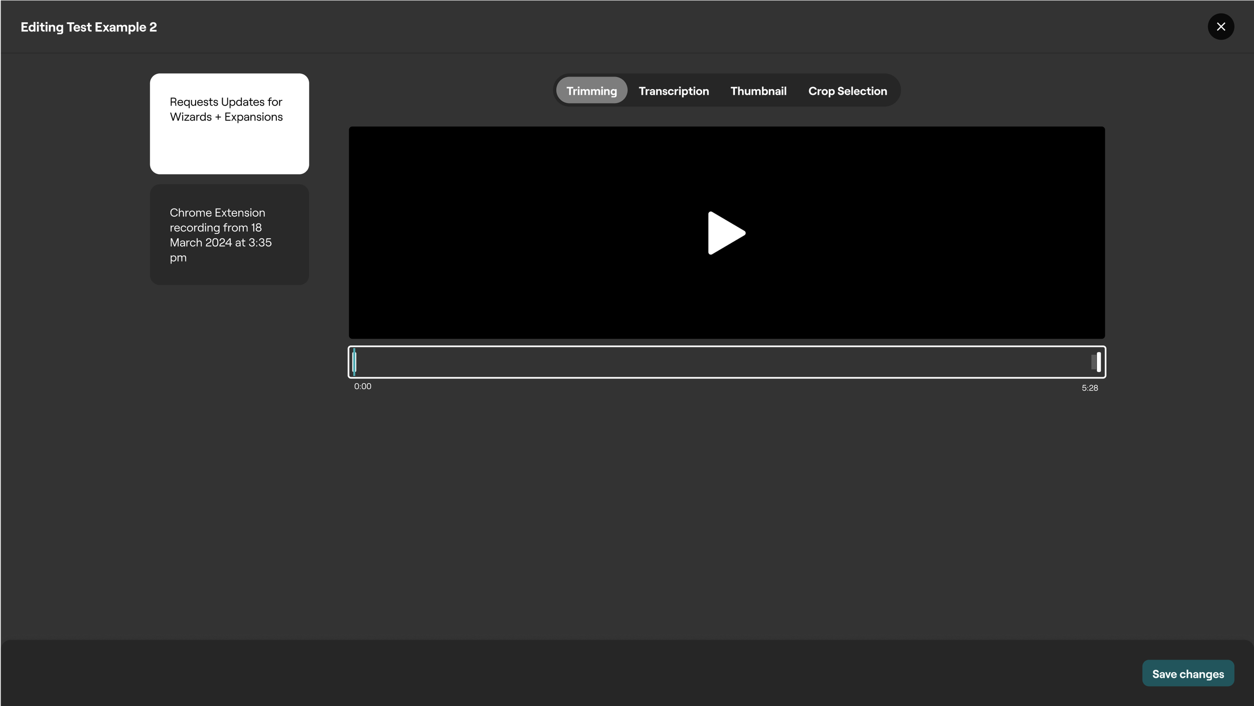
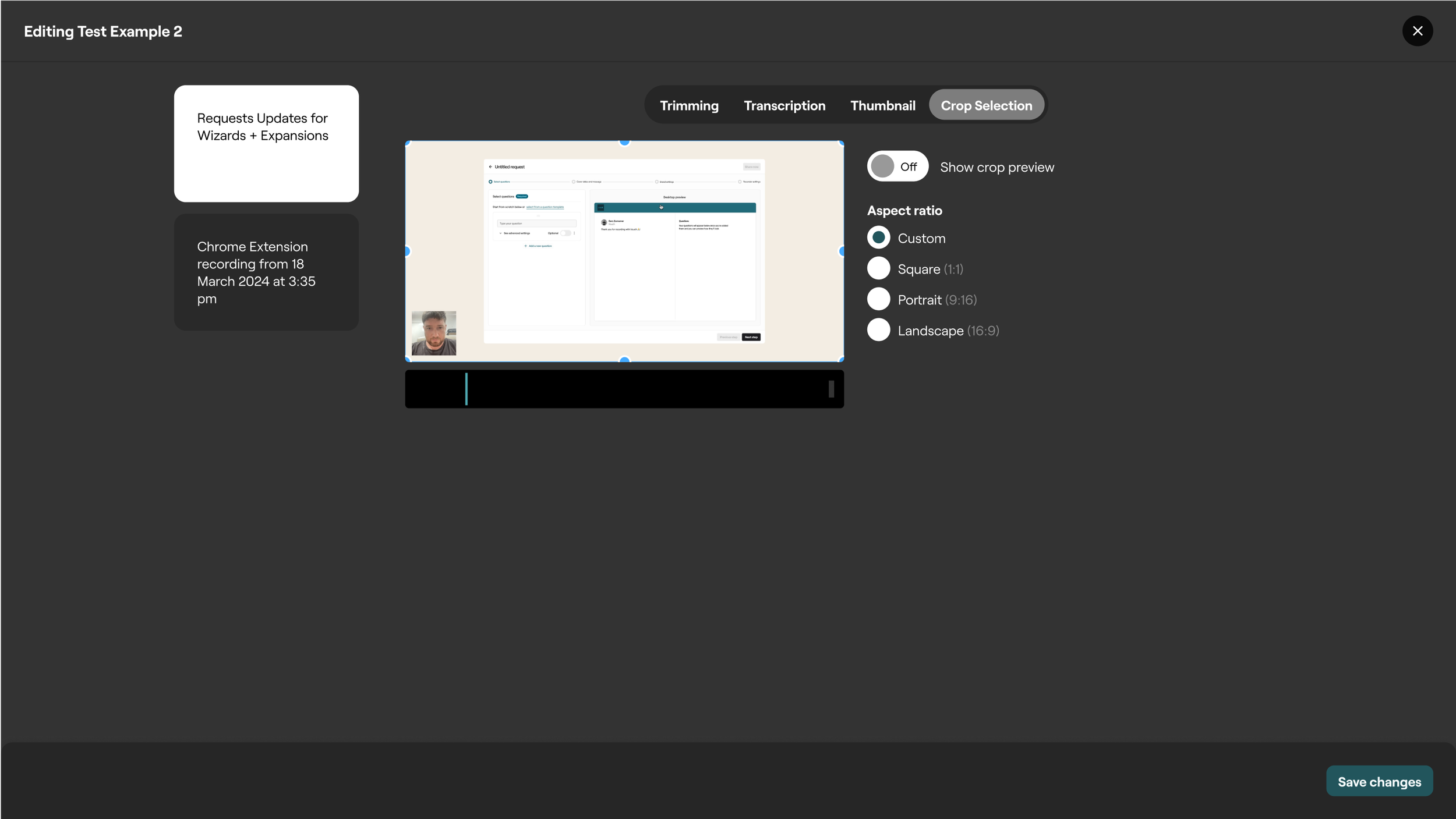
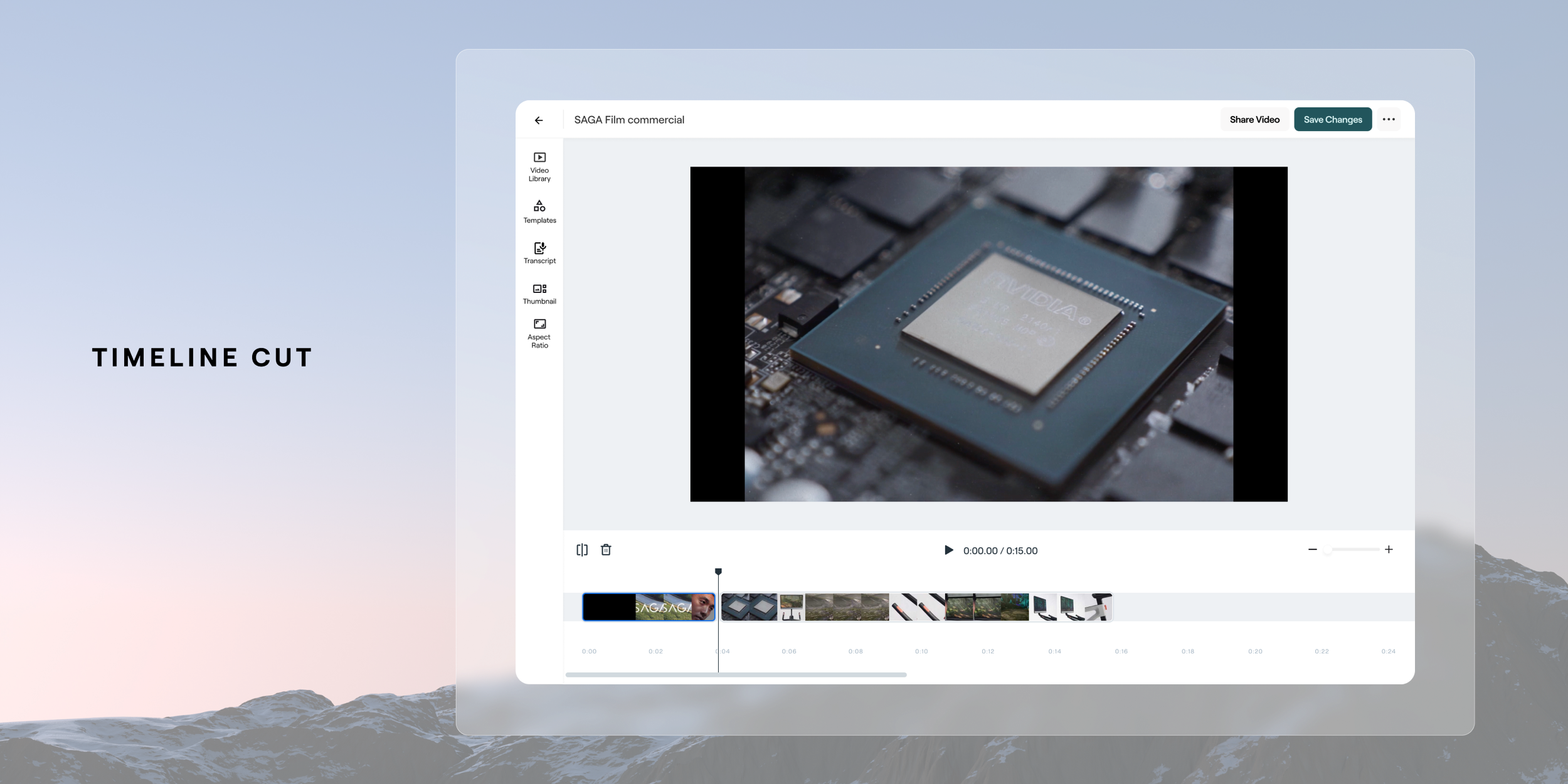
Some of the biggest issues with the video editor were centered around innefficent ways to splice footage accordingly. This meant that if a user wanted to remove an ‘um’ or a longer piece of footage for example, they would need to trim (grab the handles of the clip) to the cut point and then they would need to redrag that clip into the video timeline and then trim to the portion just after the edit. Speaking of timeline, there was no visual sense of a A-Z linear progression experience, which is fairly obtuse and not common within the video editing world.
User Journey Flows
To ensure we weren’t just building a feature without thinking through a systems level thinking we did several workshop to ensure we were framing the problem correctly and also stayed across the platform wide impact of this new feature. Here is also a proposed logic flow of when as a user how we are imagining the ideal user journey from either a fresh start with no video or an editable one. The biggest flow update to using the improved editor was to make it available at the point of each and every single video. Currently it stood as a special place a user would need to locate within a tool called ‘Playlists’ to create edits and compilations of videos. Below walks through at a broad level the idea around the main paths a user would be able to access the editor from the beginning of selecting a video to edit to the various output options.
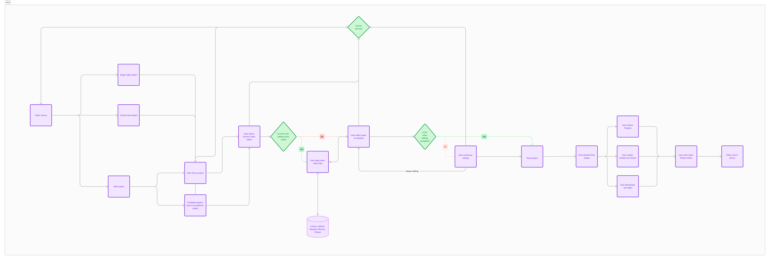
An important update was shifting the user experience towards a linear timeline, departing from the current simpler flow. Extensive secondary research was carried out to grasp the approaches to streamlined video editing. Since our user base had moderate video editing skills, our tool had to maintain a balance of simplicity in the editing process. This involved transitioning the interface from a professional tool to a more user-friendly design. Differentiating between Web and Desktop editing paradigms was crucial. For desktop editors, the workflow usually revolved around creating a 'Video Project' and then selecting media for editing, rather than directly editing a video. The distinction between video projects and individual videos in the library needed careful consideration. Analysis of platforms like Clipchamp, Vimeo, Tik Tok, Adobe Express, and Canva provided insight into web-based editing, while Premier Pro, DaVinci Resolve, and Final Cut Pro were studied for desktop editing. These explorations laid the groundwork for the evolving vision of our video editor.
Beta Demos and Customer Feedback
Weekly Demos involved actively showcasing our envisioned design solutions for the new video editor to our beta customers. Their valuable insights guided our iterative design process, ensuring alignment with real-world user needs. To validate our assumptions, we conducted rigorous Task-Based Assessments, observing users interact with the editor to gauge the practicality of our design solutions. Additionally, we regularly performed Internal Ad-Hoc Assessments with members from various teams to identify any early usability issues. Our commitment to usability extends beyond the initial launch, as we continue to test and evaluate the core feature set. Research brought for the important updates and changes such as templates and an updated linear experience.
Outcome
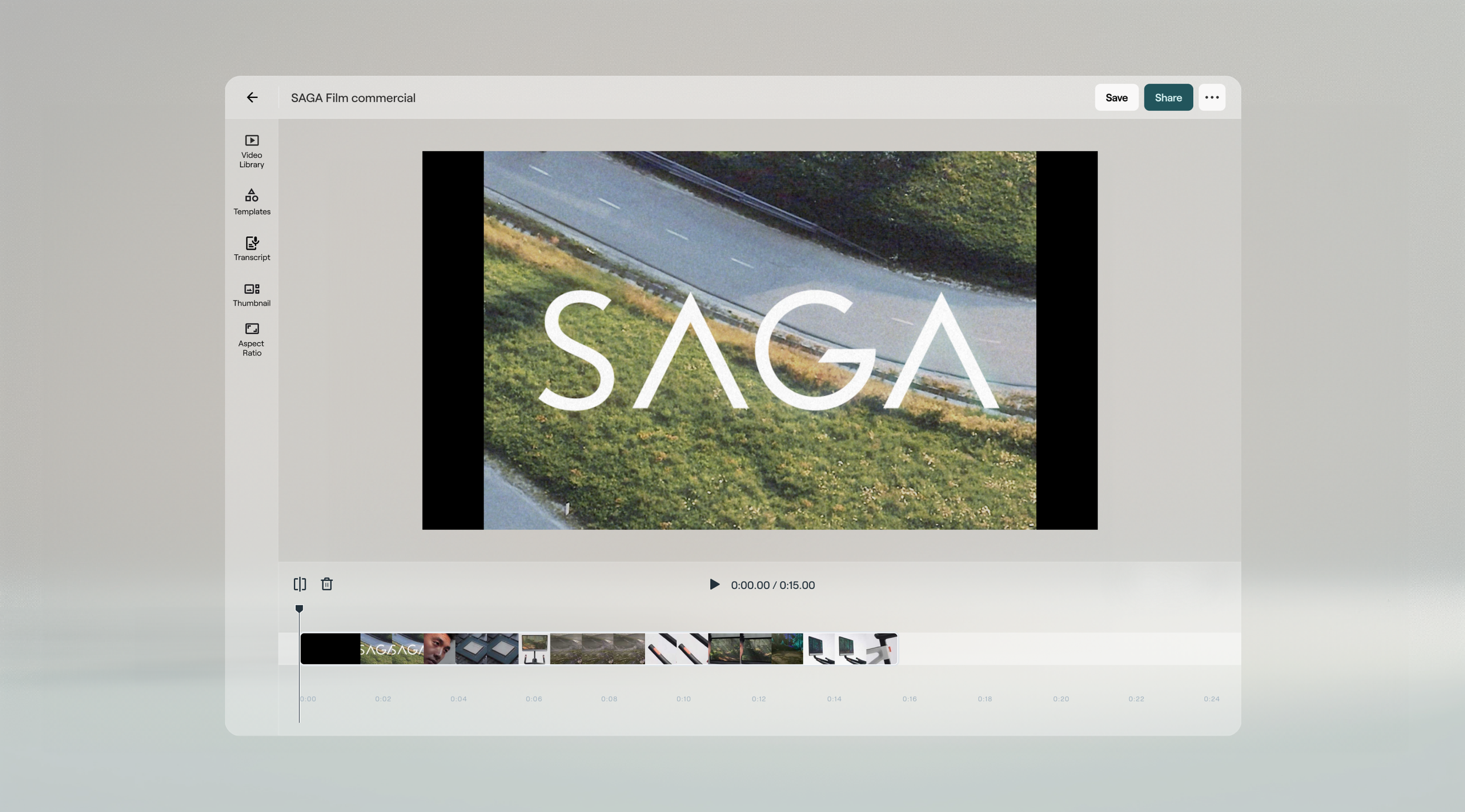
The design solution we landed on was based around ensuring the core capabilities of a complete video editor were in place for our users to manage their video timeline . To ensure we provided a stable transition for our users that were using the editor and through validation with customers that the current capability’s aligned to their needs we carried over the core functions that exist today. This improved linear method of editing ensured we stayed aligned to intuitive and common patterns for video creation. Below are some of the basic additions of splitting and deleting to manage the media on the timeline. An example of that baseline flow is below.


Video Library, Templates, Transcript + More
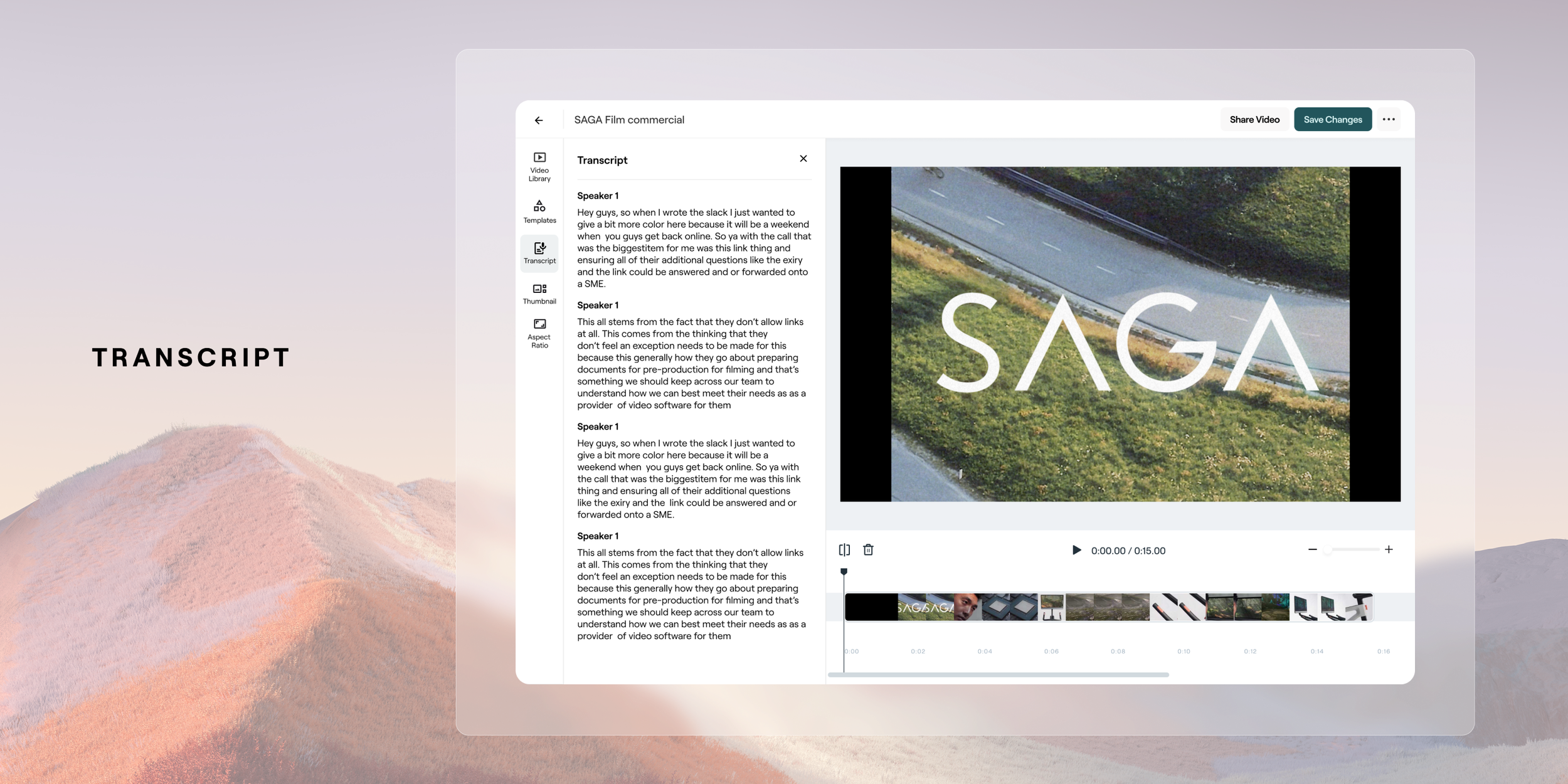
A thorough focus on being able to access your video library was put in place as a major add for users to easily access video library content, or to upload and request it. Also within here a user is ability to apply a set template which would enable a user to reapply repeatedly throughout their content. The other core features of being importance were the carry-over of the ability to edit by transcription, adjust your aspect ratio and thumbnail selection.


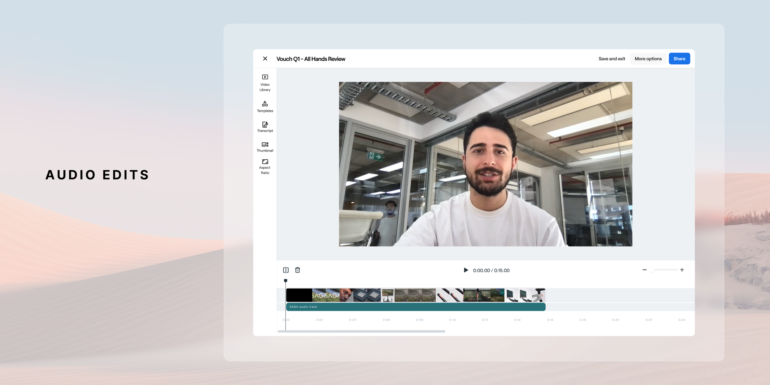
Future Development - Audio Editing
In the near future release we plan on adding an audio track layer to ensure that users have control over how they manage their audio. This is a pretty key feature to release as it’s very common to have control over the the video track and audio track to swap out elements of each. Eg, if you have a talking head shot, to swap for B roll. Below is the proposed design for this near future release. This new video editor it's a crucial step forward in enhancing our platform's video editing capabilities. It presents an exciting step forward in the capability of a platform to have a powerful and efficient video editor to give our users Through user-centric design and iterative improvements, the create compelling video content effortlessly and efficiently. This feature will continue to be fine tuned through continued iterative releases throughout 2024 and beyond as we receive feedback from users, optimize the user experience and grow the tool to meet their needs.
Video List Improvements
Following the newly revamped video editor the business decided it would be important to focus on the UX uplifts Video Library List views and then followed by the video detail view Working through the usability improvements on these pages would also be key for a complete UX uplift across the platform. Below was the current list view ahead of the UX revamp
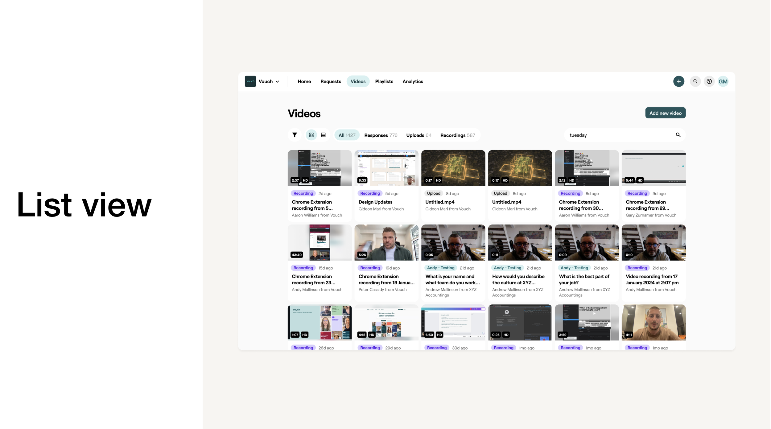
From our research and conversations with customers we came to understand the current layout of the Library list view had several usability challenges. The first one being around filters making it hard to discover. This was because when the filter was engaged it was hidden behind an all filters icon which find it challenging to visually see what filters have been applied as they do extensive searching for content. Users also could action 1 video at a time via the list view. This meant if they wanted to download, delete, share a video they needed to double click into it to access those actions
Key things to consider
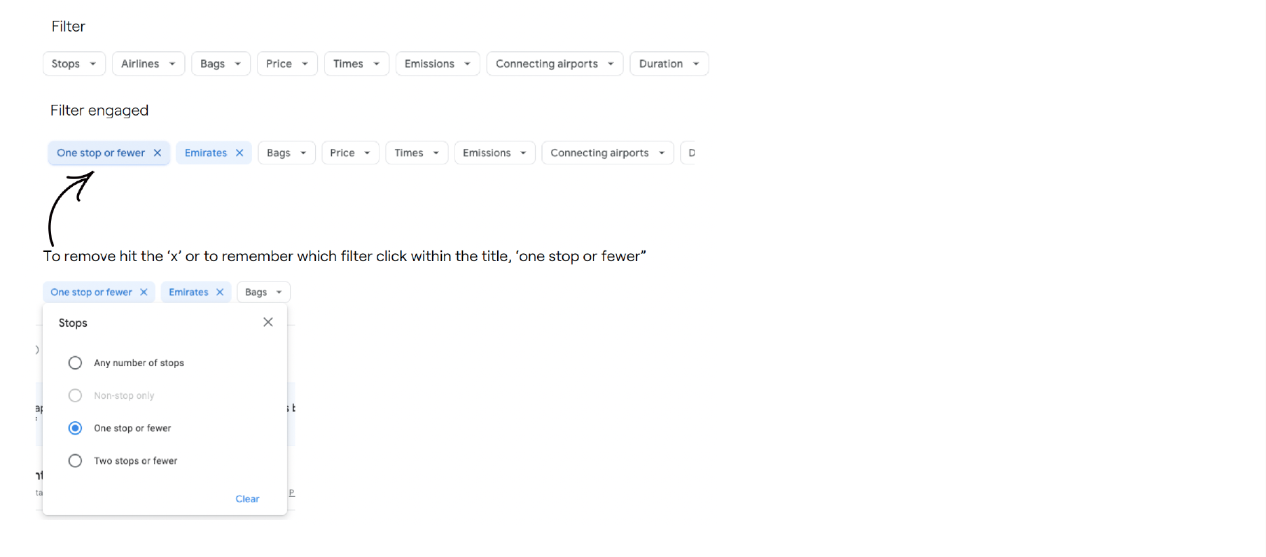
It would be important for the improved filter list views be an extension of what existed in the present day to help aid in the transition to a new interaction system style. To match the list of potential meta data the below items were ones we needed to consider including in the filter system. This also meant at updating the Video tiles themselves to also better showcase the metadata in a more clear and visual way. The metadata that needed to go on the cards
Type (eg an upload, a video from a request, recording, etc)
Organisation (The video creators associated company)
Contacts (the video creator)
Tags (labels the user has attached as metadata)
Requests (which outbound video request did a video originate from)
Questions (when requests are selected, shows which question they answered)
Concept Explorations
The goal was to design a familiar user experience for video library applications. Research involved exploring common layouts and filtering patterns, leading to the discovery of an intuitive method forselecting parameters with cascading logic based on dependencies. Google’s parameter search is one many of us have used to travel domestically and internationally. The basic interaction pattern I’ve emulated is when a filter is applied, it appears as a down selection with the parameter row and you can easily reference as you add further selections.
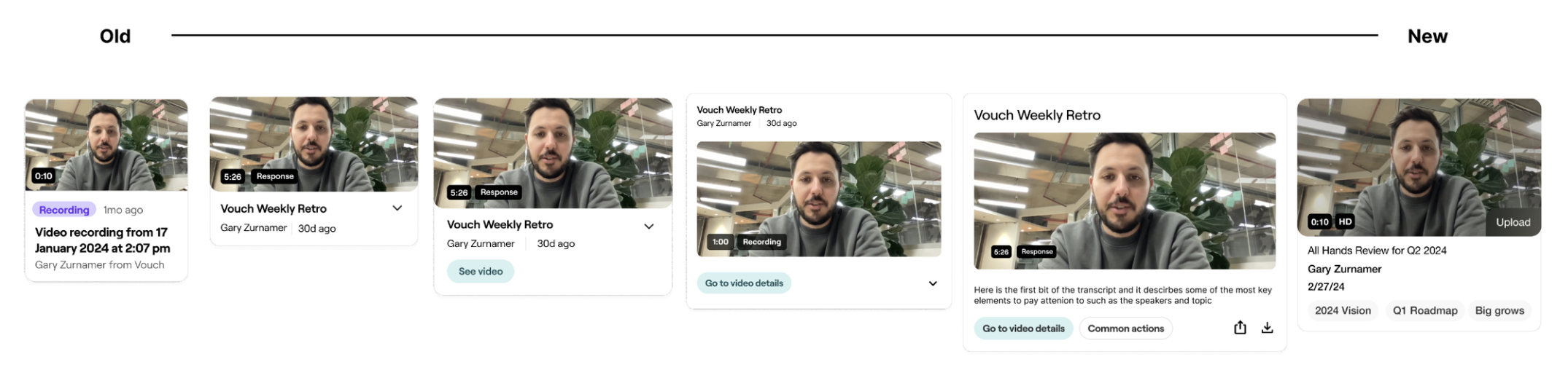
Video Tile updates
As the filters were being so were the video tiles themselves were finessed as well to be more apt for scanning and locating some of the metadata content. Here is the evolution of concepts from starting with what was the original tile to the final version selected. This helped support the video list filters view updates as well as the bulk action updates.
Bulk Selection
As the project moved further into refining the filters also too hand in hand was the bulk selection updates. Users cannot perform actions directly from Library list views, requiring them to access individual videos for tasks like deleting or downloading. This significantly reduces usability and efficiency. The aim to move at speed was to extend was formerly at a video detail level up to a list view. Those actions included:
Delete
Download
Share
Embed
Update contact
Create video from
Add to current video
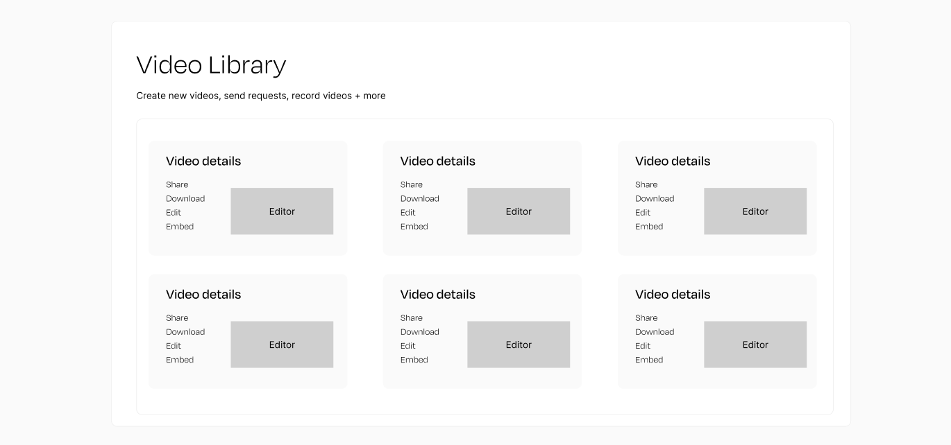
Below showcases the hierarchy of the page from the Video Library list view. Underneath the umbrella of the library we also see the individual details page and the video editor within each page itself.
Video Details
The layout of the video details page make the features of the page hard to discover and thus impact consumption, creation and distributing. The left hand vertical options and configurations feel hidden away and buried beneath menu’s. Outside of improving discoverability the aim was to also highlight some of the other powerful other capability’s of the page such as AI summary’s and transcription editing are partially blocked by their placement near the bottom of the fold of the page.
Improved Filters Design Solution
Here is the fully detailed and updated Filters UX along with the updated Video tiles. We were able to track a reduction in manual actions, an improvement in efficiency of time spent on the platform, an increase in our NPS and in turn less churn with customers and more renewals.
New Bulk Action Capabilities
In a similar positive reaction and outcome to the filters, the addition of the bulk actions proved to be highly beneficial in enhancing the efficiency of workflow processes. Mirroring the increase in NPS score of the filters, the utilization of this feature also emerged as one of the widely favored actions on the platform, effectively aiding teams in content management and improving overall user experience.
Responsiveness and Mobile Design
An important element of this initiative was also about was ensuring the User Experience stayed the same across devices. The responsiveness of the website ensured that whether on a phone or desktop you’d still have access to all of the same features and capabilities. This was beneficial and key for alot of our customers who were capturing content and manageing their video libray’s on the go.
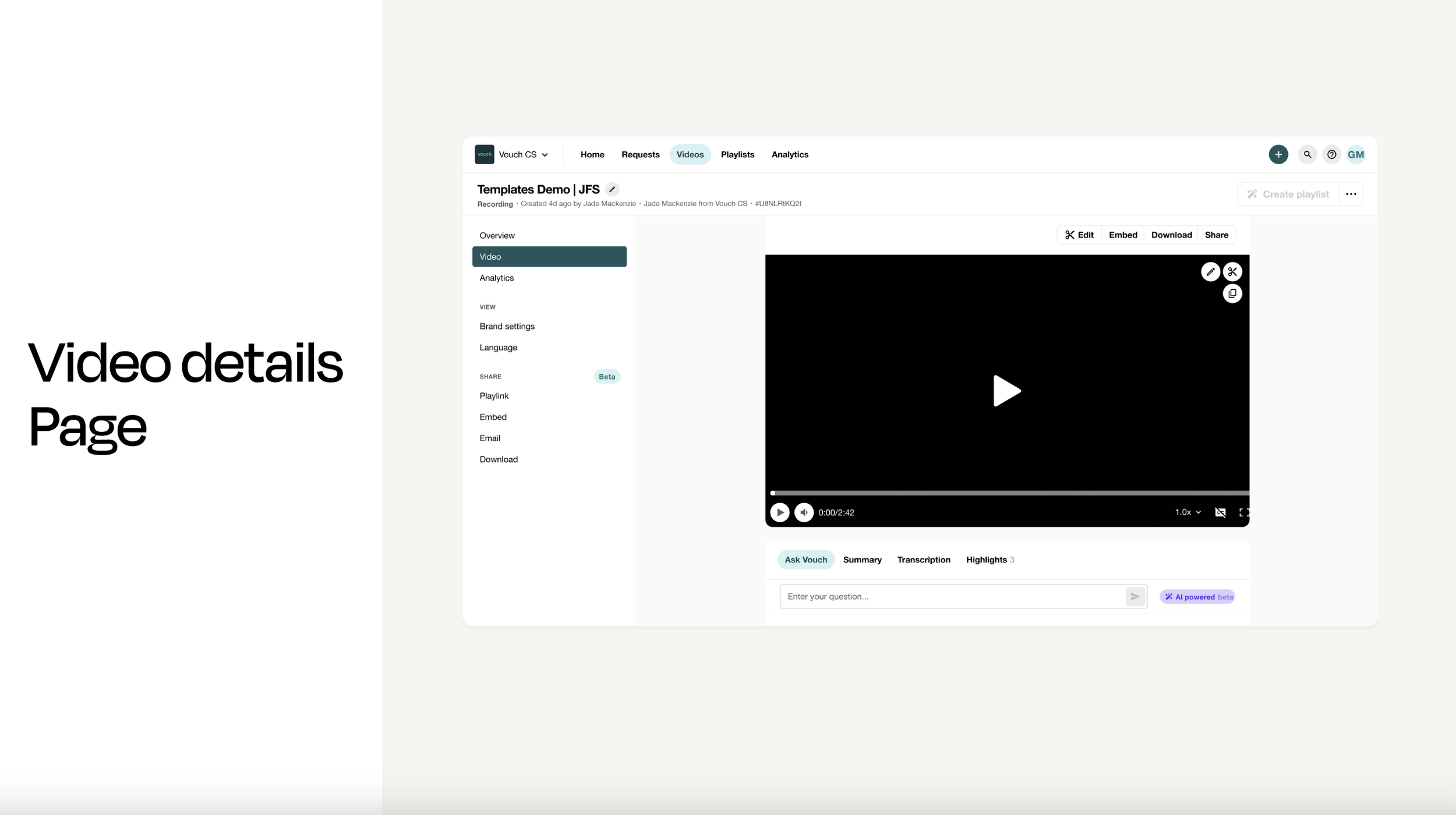
New Video Details
The video details page’s uplift also played an important role in threading all of the improved flows and features from the list view and editor together. The update to the layout to have all the main actions visible within the first fold and a step away from vertical and horizontal menu’s made the experience more intuitive and discoverable to customers. It played hand in hand with the other improvements in terms of feature usage, video outputs, and increased customer satisfaction. This played a key role in Vouch’s transformation into being the leader in the video platform space for customers in this market.
Conclusion
My time at Vouch gave me the chance to work within an industry and medium that is near and dear to my heart in the world of video. I had the chance to deep dive into a startup video platform and gain experience in the fast paced nature of a small business. I had the chance to create and improve the UX process for their core product and other supporting features. The outcome of these features have had a tremendous impact for customer adoption and also providing a platform tool that gives users a full end to end solution for their workflows.