Video editing, simplified
Company
Vouch is a video-first platform designed for teams focused on attracting, engaging, and retaining talent by creating authentic stories and showcasing culture to promote the company.
Role
I was the Product Designer who led the end to end uplift of the product from the research to implementation. I worked with a Senior PM, a Development Lead, and another Software Developer. This project ran for 4 months. Concurrently time was also split between other feature improvements to the rest of the video platform, such as adding bulk actions to the video library, improving the flow to request videos and other detailed pages.
Problem
Vouch’s video creation tool called ‘Playlists’ was being used by only 40% of users on our platform. This was a significant business impact for a video centric company intent on providing the best end to end solution for users looking to collect, create and share video content. This had direct business impacts to account churn, satisfaction and new customers. As a result, more customers were not renewing, sales began to dip and overall customer satisfaction began to decrease. Seeing the writing on the wall, improving the video editor was prioritized from the business amongst a series of other improvements to improve efficiency and optimize the user experience.
Research from customer conversations, data analytics and internal heuristics revealed a number of compounding number of factors that were driving this feature under-adoption. First it lacked important editing capabilities that as a result were underserving the needs of our customers who needed a more robust option for video editing. In typical scenario for a customer, they would have collected a number of videos and then for the output needed to share a video pulled from the highlights of the videos. Eg, a company ‘round table’ video with executives and employees, they would like to assemble the biggest moments and output a video. A user could trim and delete but not split, which meant it created a headache for those looking to make precise edits between removing fillers words or run on sections of videos. In order to make the equivalent splice, a user would need to create a number of copies for videos to match the number of trims they needed to make on the video. So if you needed to remove 5 “ums”, that clip needed to be added 5 times and then trimmed to and fro those sections. This created a hugely inefficient workflow for customers that could do this more simply elsewhere.
Funky Vertical Editing
Compounding this was the UX of the editor. Intended as a more lightweight way to consecutively edit a number of videos, it had been designed in a Canva or perhaps more presentation focused layout. Rather typically video editing for most people involves a linear experience centered around a timeline. This created additional headache for users wanting to make concentric cuts to their clip, as with a vertical stacked assembly of clips made it difficult to trim from the previous point.
Vertical Editing vs Linear
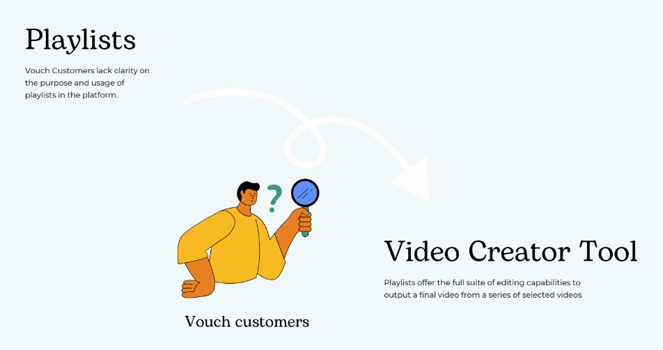
Name confusion
One further complication was an issue of branding and the resulting misunderstanding from customers on when and how to use the video editing tool. It was called ‘Playlists’ originally in effort as concentrate the focus on the lean, lightweight way to assemble videos. Yet the naming convention of a playlist from popular culture has a closer association to gather already assembled content and sharing it out that way, such as a Spotify or YouTube playlists. The closest metaphor in the video world is creating a Video Project, which commonly found in the desktop video editing space in programs such as Premiere and Final Cut Pro. This editing feature it was also only available on specific section called Playlists on the website you had to visit in order to create a video composition and not at the individual video level. So users felt confused about where to video edit and compounded by the other factors over time created a death spiral for video editing on the platform.
Process
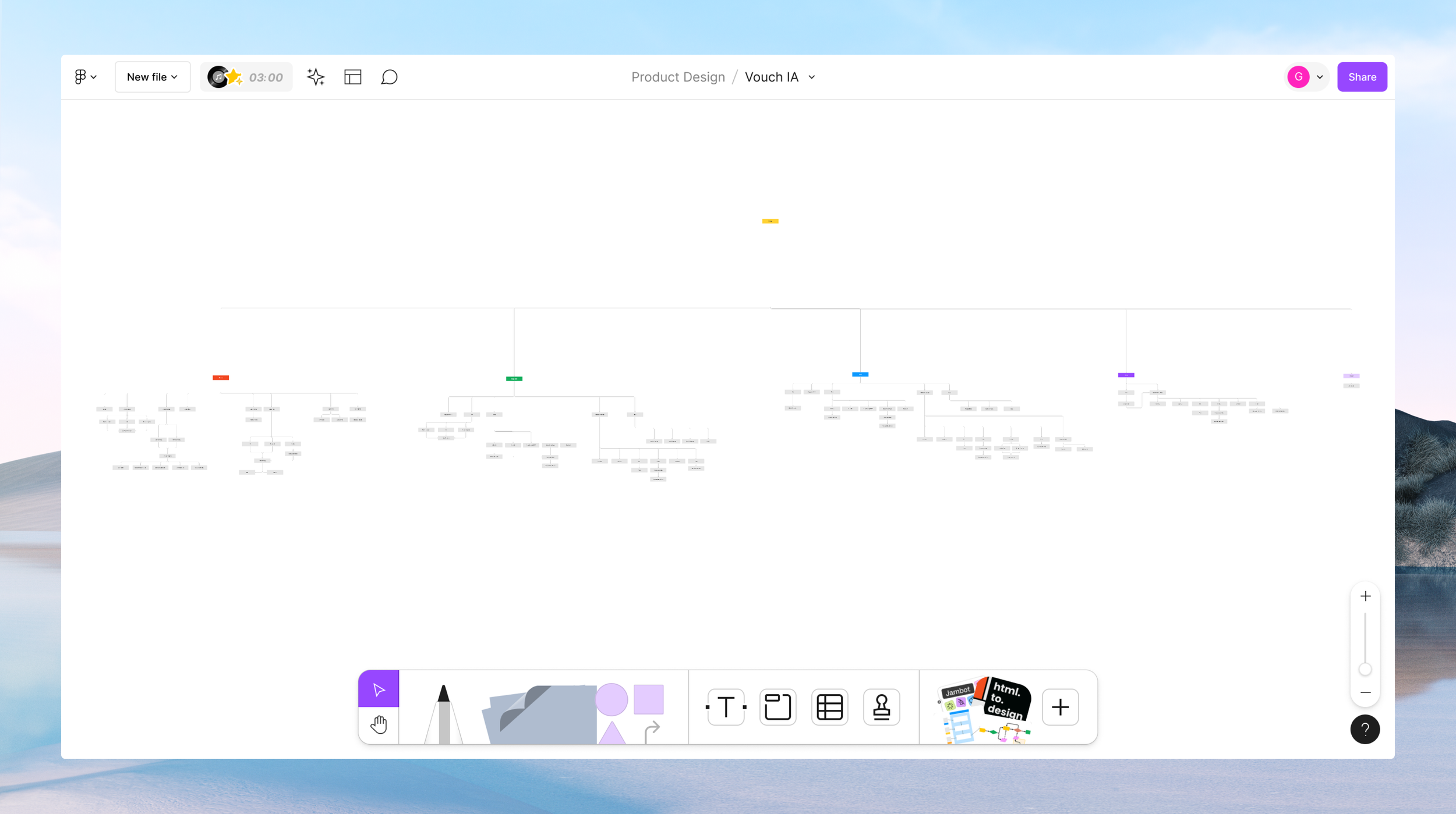
To better grasp the extent of Vouch’s video platform I mapped out the various capabilities of our site. As several new features had been released over the year and in between design elements coming and going, a new map was needed to list visually all of our features and services. This involved thorough dog-fooding of the product and in turn also began to bring to light any usability considerations to address. The challenge inititally that could be seen is the myriad of features shipped overtime with either no longer apt use cases or a need to be reinvested in to bring up to speed with user needs and our customer focus.
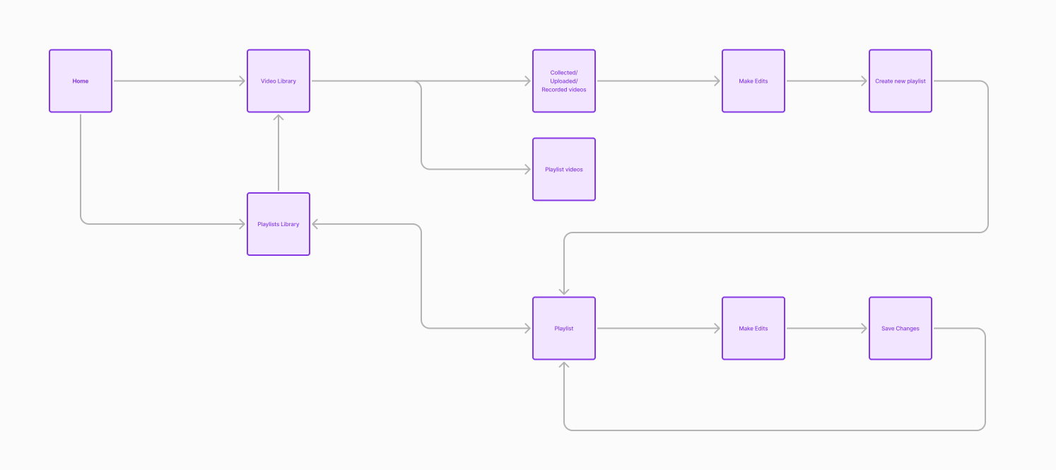
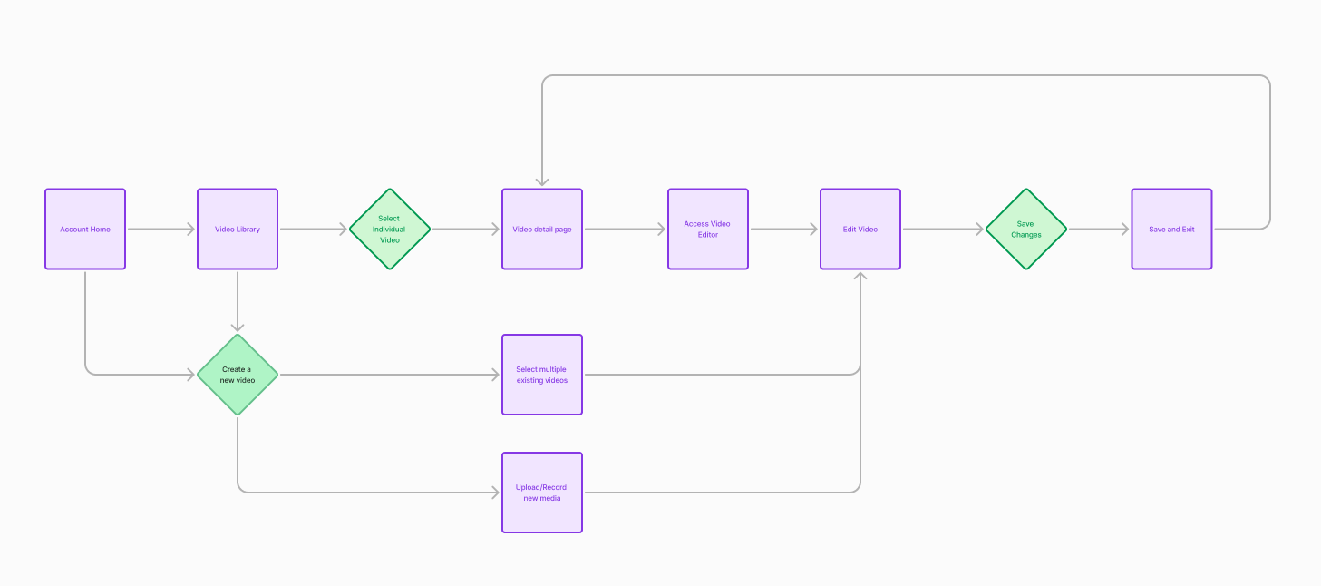
To take it from a 2X to a 10X view, the above walks through at a high level what happens when you start at your account level and then based upon your need make a decision about where you need to go to accomplish that outcome. If you wanted to review all of your videos in your library, which had either been collected through a video request, uploaded or recorded yourself or videos specifically newly created, called playlists, you could from this view. In the video library you could review, download, delete and share. If you wanted to edit however, you needed to either from the beginning experience at the start or once at a list view, or individual detail video view, decide you want to edit, you needed to create a new ‘playlist’ or you could also add to an existing one.
Existing user journey to create/edit videos
A follow on usability workshop was held across the internal teams to highlight issues that they themselves see everyday and or have heard from customers. A general trend was in general for main core flows to be streamlined (eg, fewer clicks and layers in), navigation to be simpler and broadly for features to be updated to the current new customer focus. Below, I provide an in-depth breakdown of each feature from those workshops, along with prevalent themes that emerged from each feature. In total there were approximately ~ 151 feedback notes for all the 15 features reviewed. An individual feedback note being defined as an individual sticky and or bullet point within each feature column where all notes were listed. Those insights can be seen here - https://drive.google.com/file/d/1LvZxeFywFIZvfDWnyNac5DhQRbG3q17C/view?usp=sharing
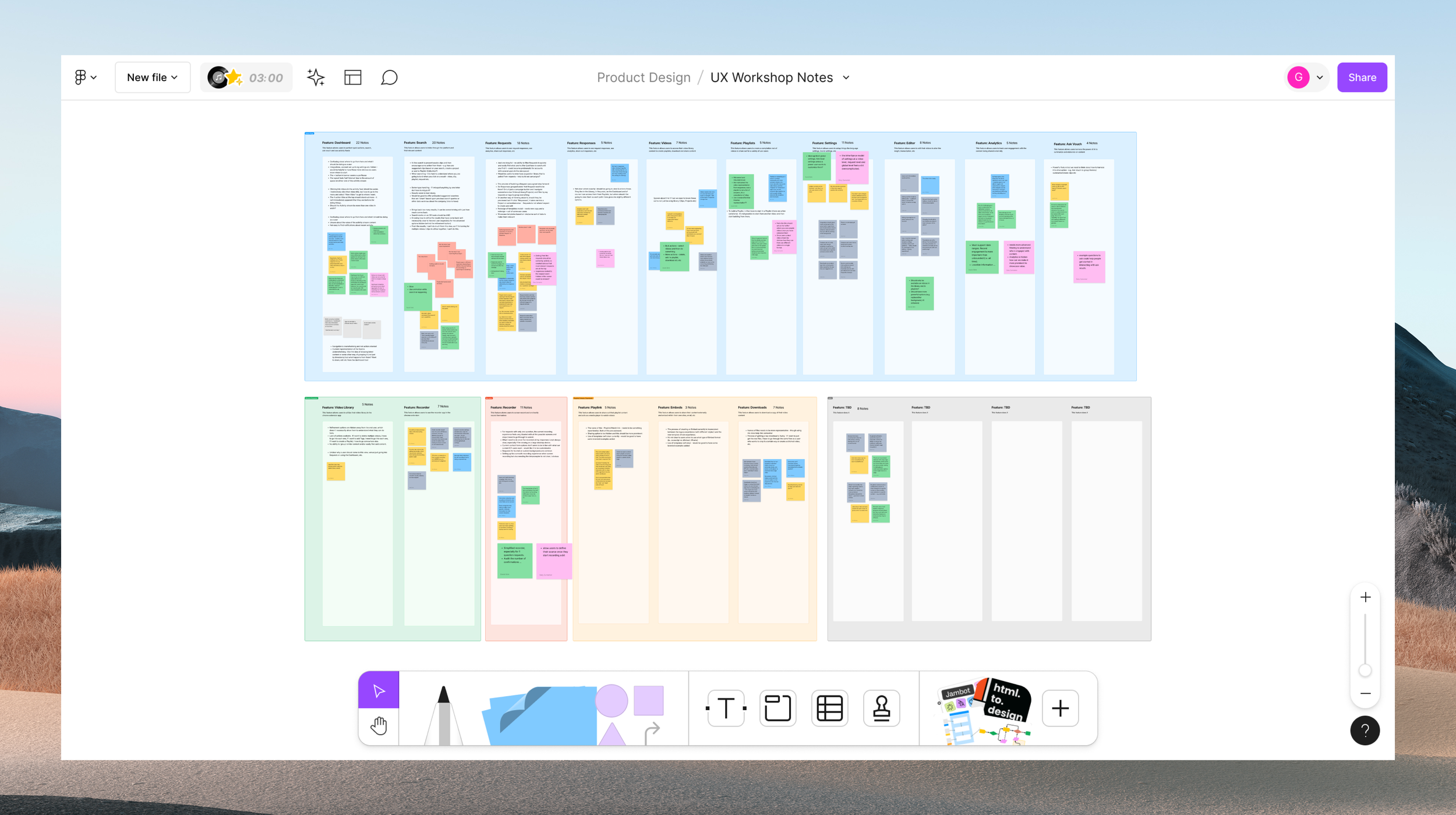
UX Workshops + New Project Kickoffs
Around this time Vouch kicked off a project to revamp the platforms core features. Across the whole platform several themes themes spotlighted for universal usability trends. Users express significant challenges with navigation and visibility across different sections of the platform. There's a consistent desire for easier access to global settings, integrations, and key functionalities, as well as clearer guidance on how to use various features. Improved workflows, more intuitive action buttons, and enhanced overall user experience are crucial to reduce confusion. Users also highlight the need for better organization and management of content, such as requests, responses, videos, and playlists, suggesting enhanced filtering, sorting, and grouping options to improve content discoverability and usability.
Additionally, users seek features more aligned with their specific needs and workflows, emphasizing the importance of customization options. Performance issues, including slow loading times and cumbersome workflows, highlight the need for optimizing the platform for efficiency and responsiveness. Integration and collaboration features are also crucial, facilitating communication and teamwork. Users request more robust editing and recording tools, including options for splitting, editing transcripts, changing thumbnails, and simplifying the recording process. Finally, there's a strong call for consistency in UI, workflows, and functionalities across the platform to create a more cohesive and efficient user experience, with fewer clicks and more linear processes.
New Customer Market
Vouch was going through a series of transitions to try and find the right market fit from when I joined. Vouch originally was focused on employee advocacy, an easy way for teams to use video to ‘Vouch’ for another’s team. As customers needs evolved so did the market fit. After several explorations into the business and sales use cases Vouch eventually landed on supporting companies that work within Employer Brand (EB) . EB involves cultivating a positive image and distinct identity in the job market to attract talent. The primary user personas within the EB function are Talent Attraction (TA), and Talent Acquisition (TQ).
Talent Attraction professionals align recruitment strategies with the business's vision and collaborate with leaders to drive hiring and retention efforts. They tailor branding initiatives, develop engaging content, and manage a library of resources. Challenges include measuring the impact of employer branding efforts and managing competing content requests. Employer Brand professionals build and maintain the company's brand identity. They communicate the company culture through brand assets and video creation, collaborating with Talent Attraction and Creative Departments. Challenges include adjusting creative content to shifting strategies and quantifying the impact of branding efforts.
UX Focus - Improved Video Editor
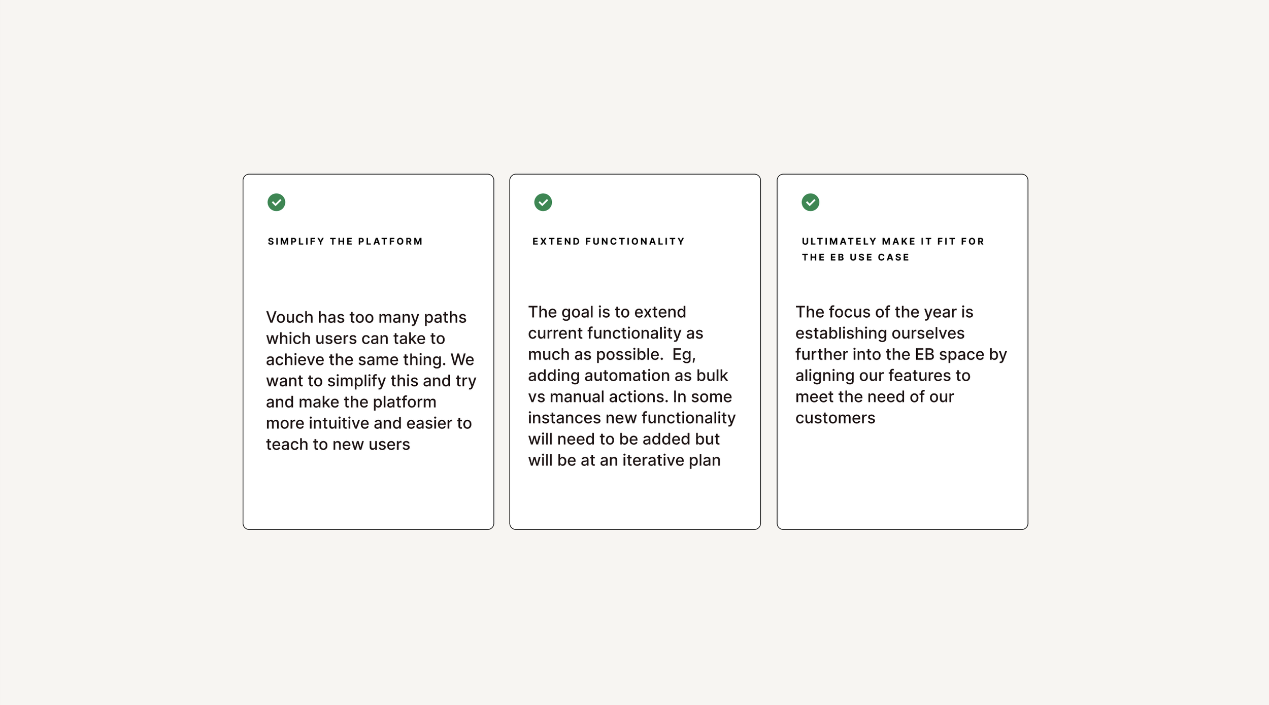
Collectively with the usability evaluation done and along with customer feedback there was a business directed a roadmap of major improvements was put into place. Themes and specific usability challenges emerged from these conversations and efforts and priority workshop was run to decide which features would have the biggest impact and elevation to the user experience. From there it was decided by Product and the Business to focus is of the Video Editor. Originally as a video platform the goal had been to have a lightweight editor where one could stitch together videos. This limited editing experience became a point of friction as our customer base evolved to be those with an expanded need of capabilities to do thing like splitting clips, using video templates and more.
Success Measures
To enhance user engagement, it is crucial to monitor the percentage of active users who access the Video Editor regularly, aiming to increase this from the current 40% to 90%. Additionally, tracking the average session duration can provide insights into user engagement, with longer sessions indicating higher engagement. For new user onboarding, measuring the percentage of new users who explore and utilize the Video Editor shortly after signing up is essential. A successful onboarding process should lead to increased feature adoption, which can be further analyzed by examining the frequency with which users engage with the Video Editor, indicating its successful integration into their workflows.
Content creation volume is another key metric. Quantifying the number of videos created using the Video Editor and setting targets for increased content production can drive improvements. Specifically, tracking the usage of Playlists within the Video Editor and aiming for a substantial rise in Playlist creation can provide additional insights. By understanding how frequently users create content and use Playlists, we can better assess the tool's effectiveness and identify areas for enhancement to boost productivity and satisfaction.
To gauge user satisfaction, regular collection of user feedback on the Video Editor’s usability, features, and overall satisfaction is important. High satisfaction scores indicate successful adoption and highlight areas where the user experience is positive. Assessing the Net Promoter Score (NPS) can further reflect the likelihood of users recommending the Video Editor to others. A positive NPS signifies successful adoption and suggests that users are not only satisfied but also enthusiastic about the tool, further validating its value and functionality.
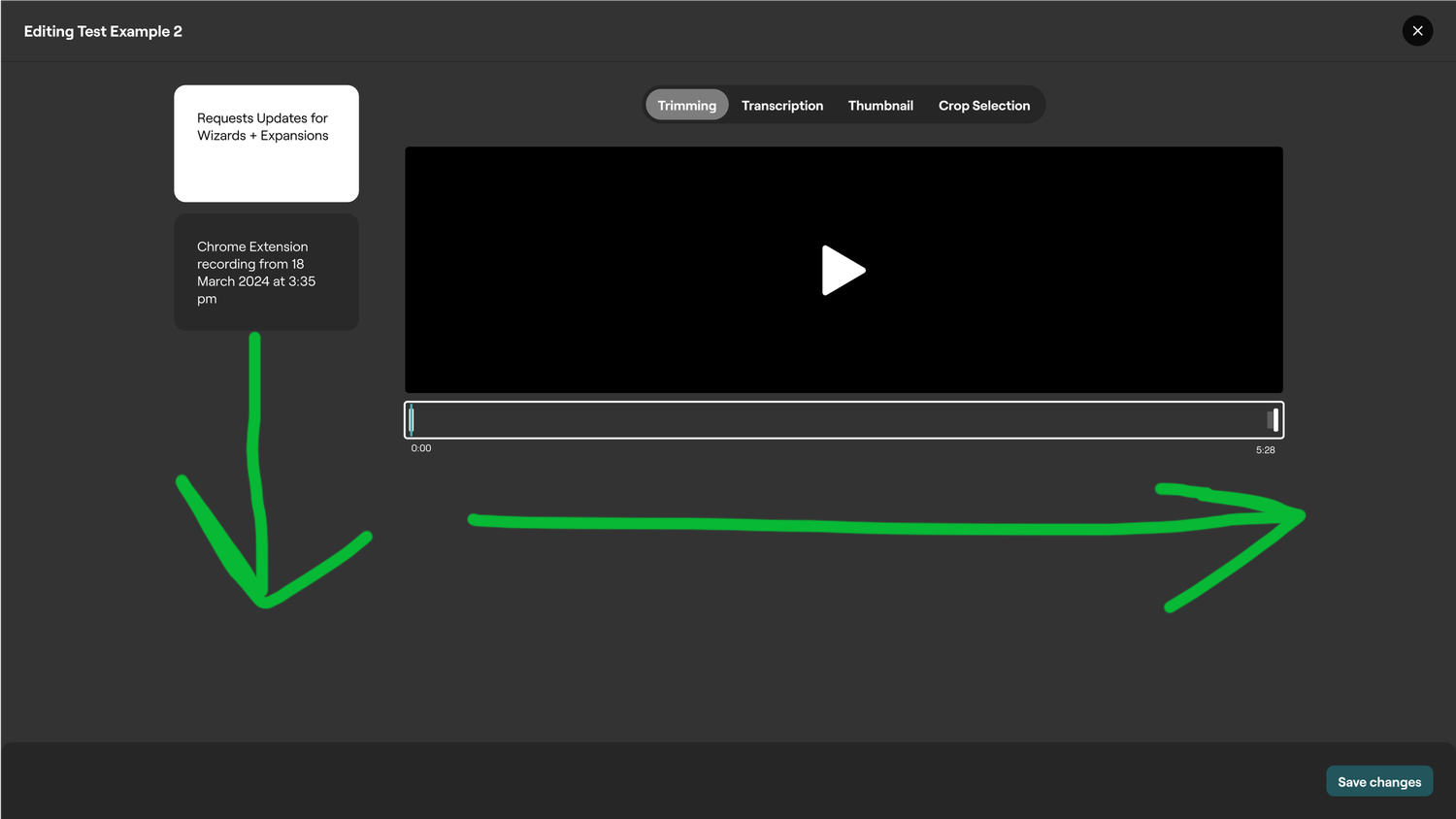
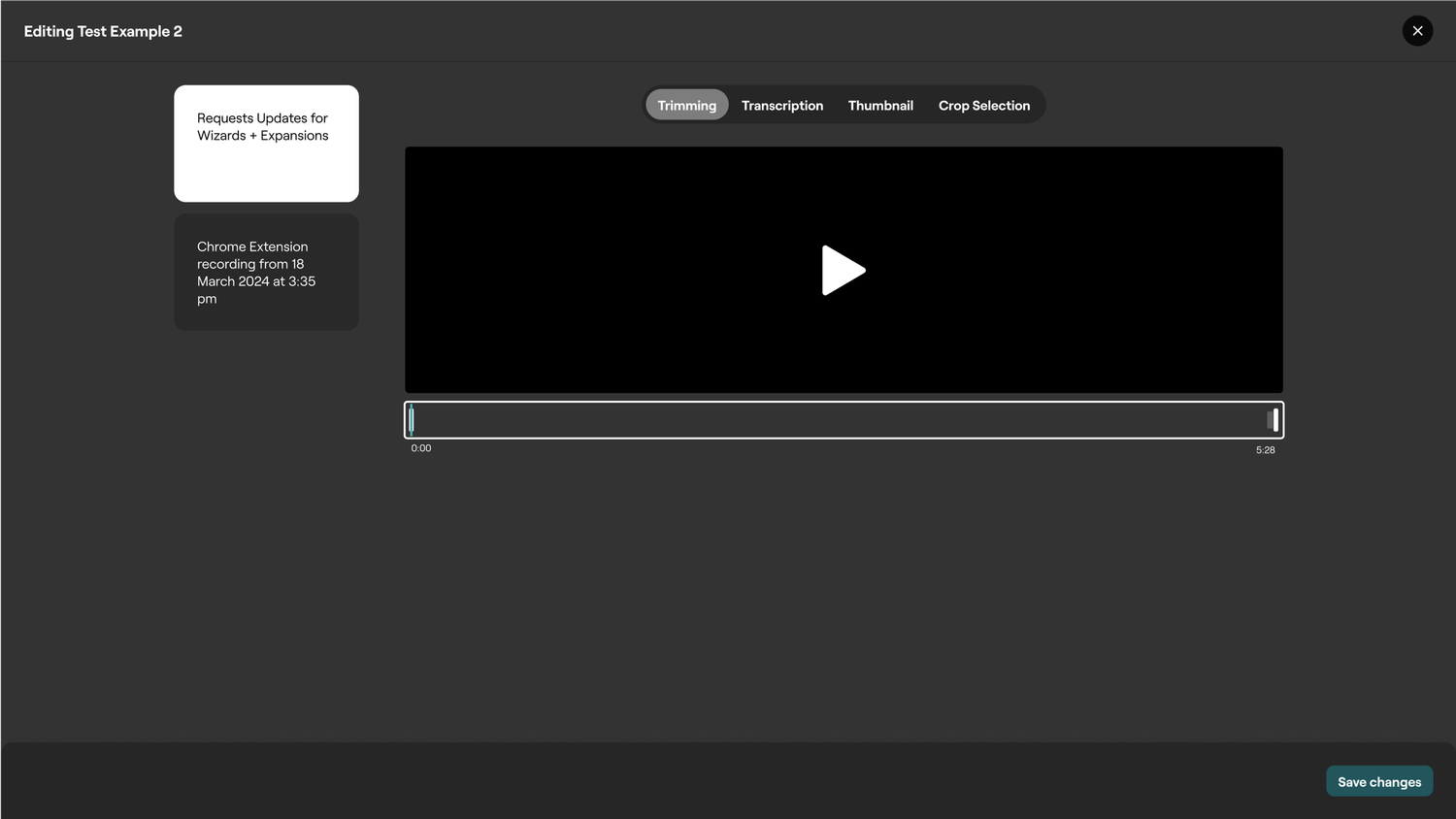
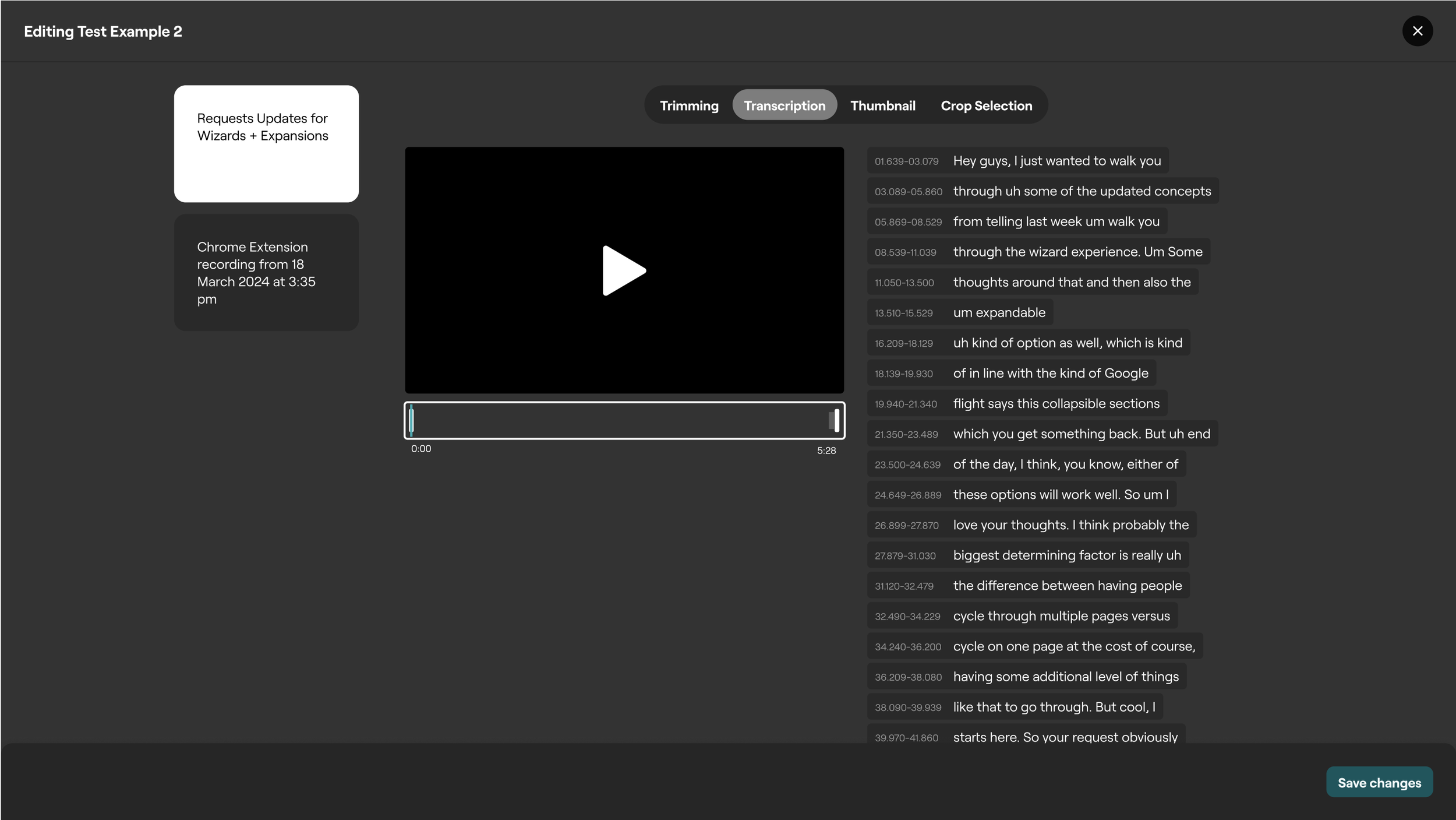
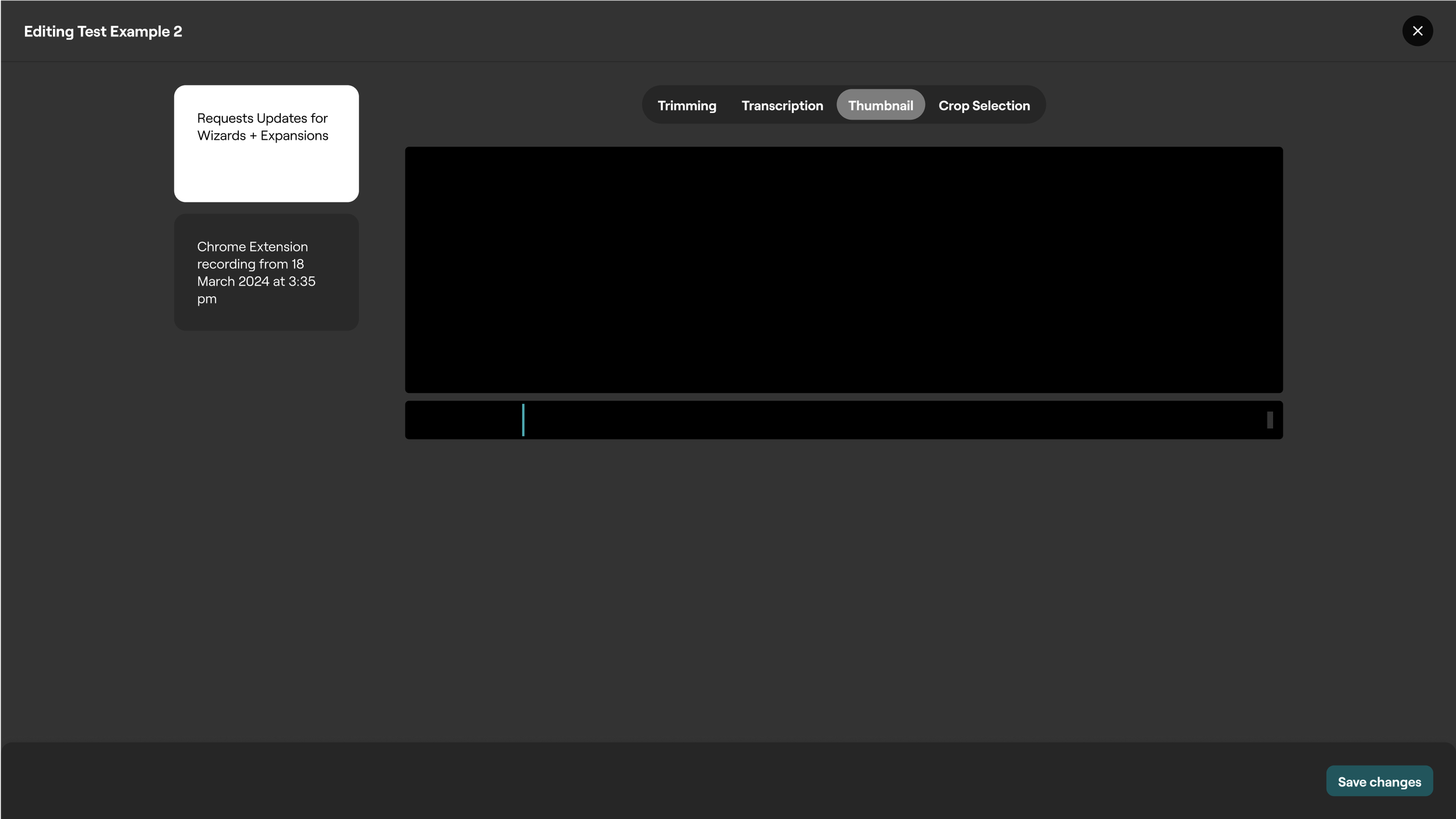
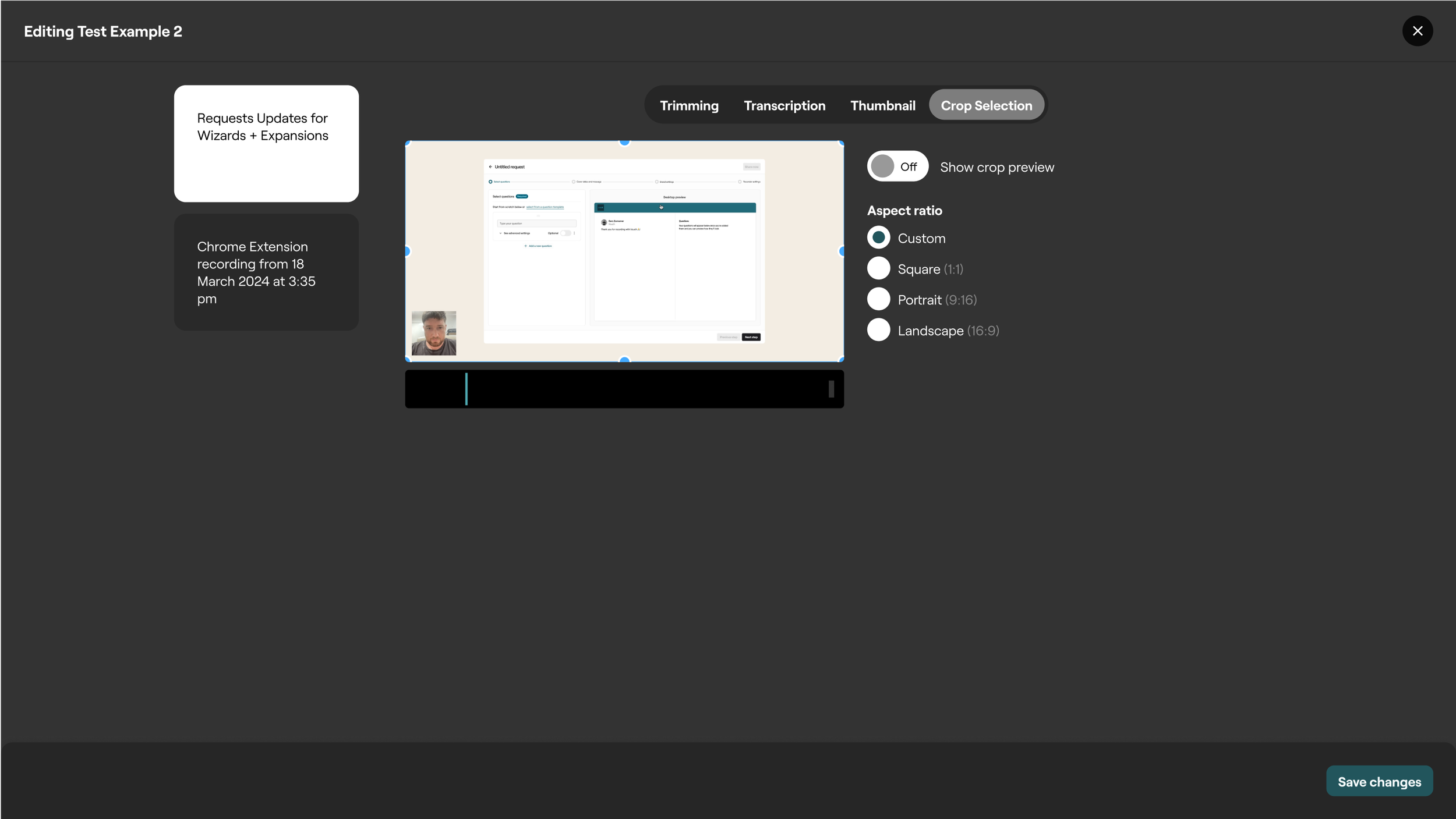
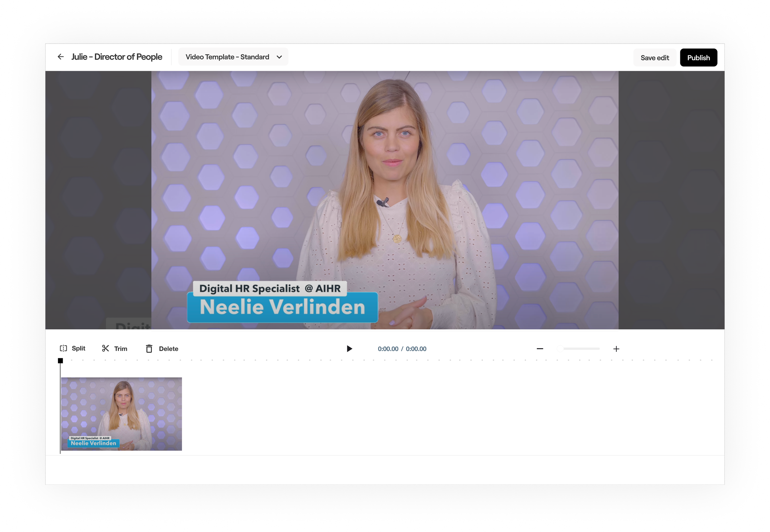
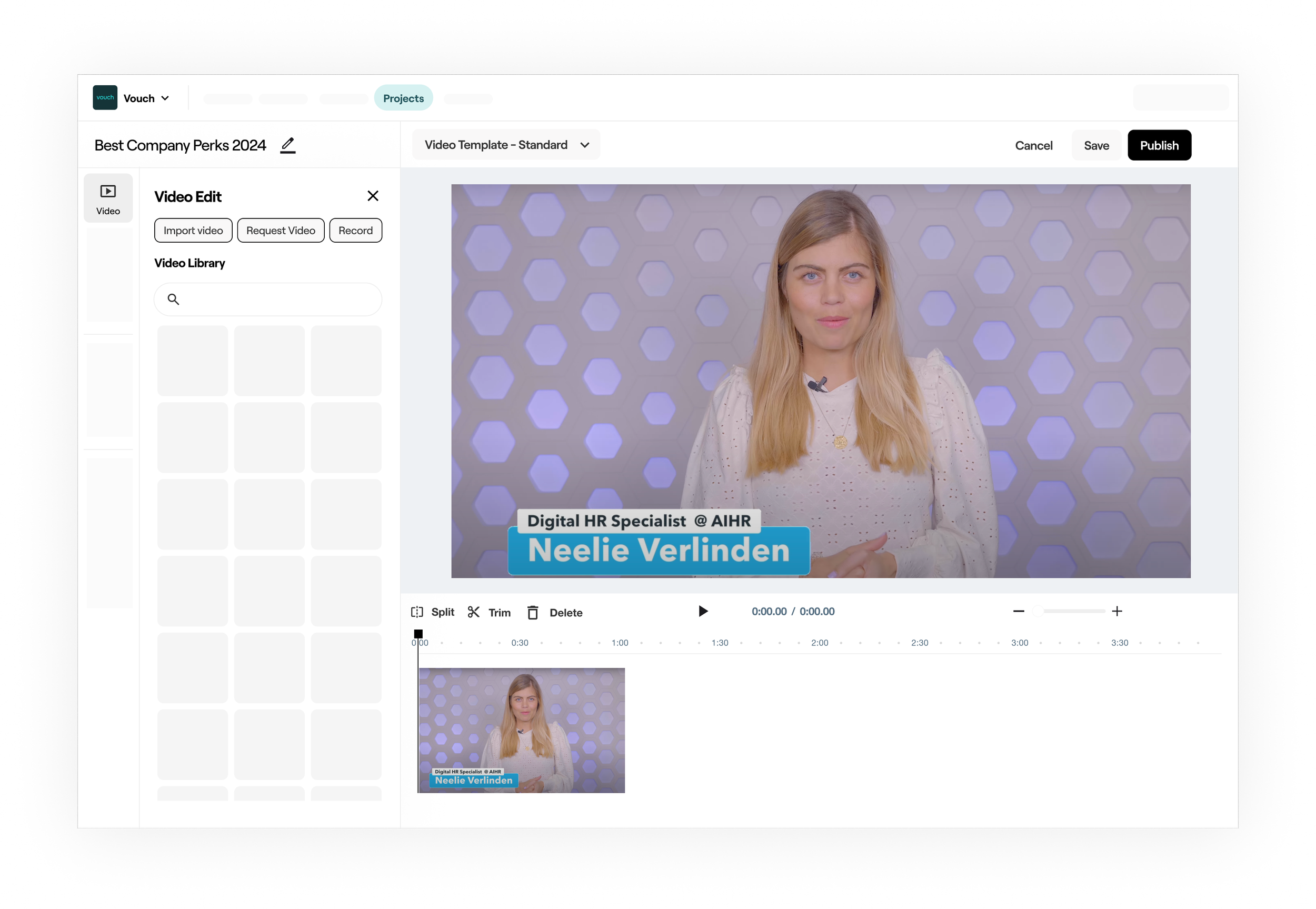
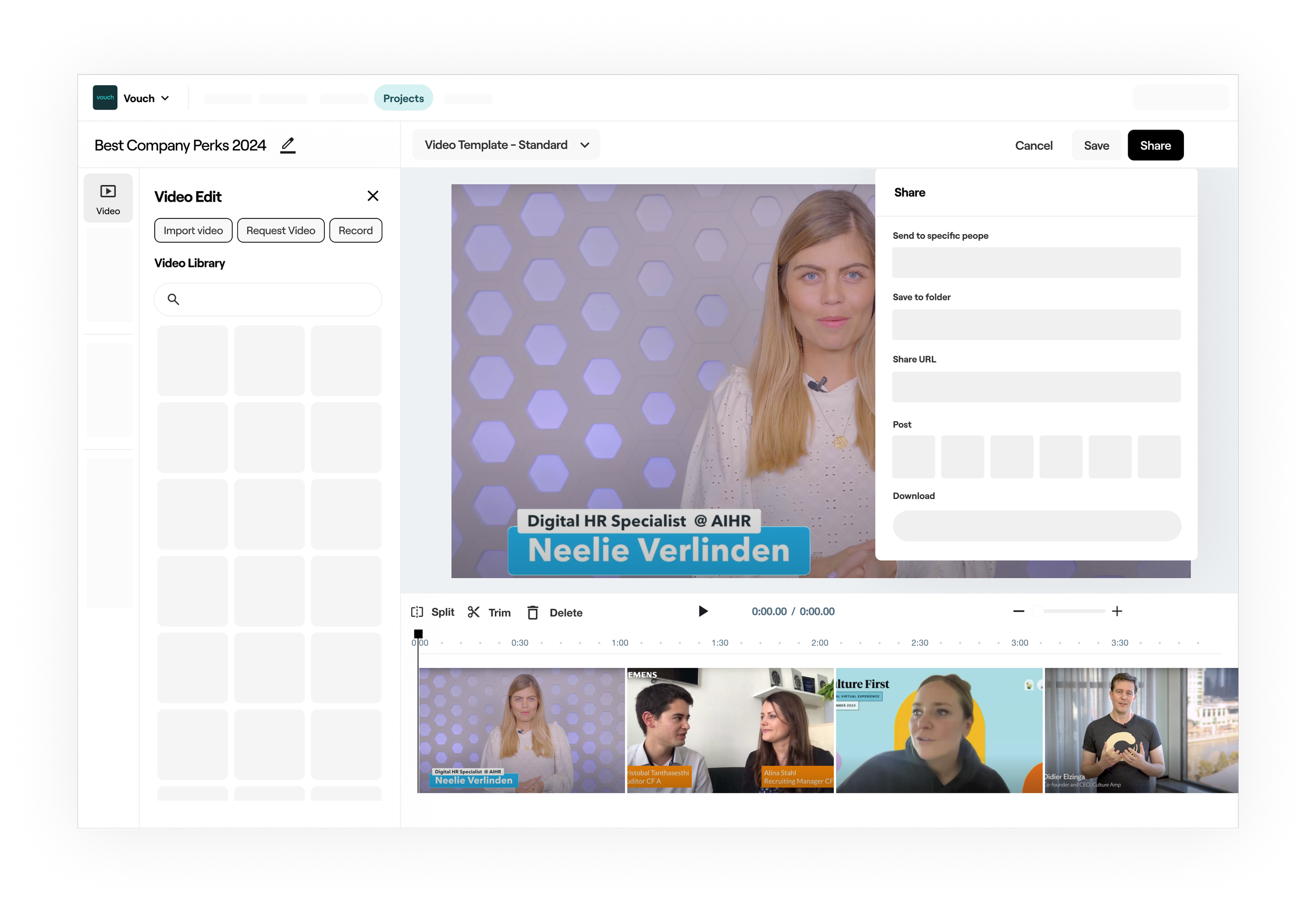
Current Video Editor (Playlist Editor)
The previous tool for video editor was deisgned as a lightweight way to stitch together videos. It was also more aligned to a telempropmpter way of cycling through videos as most original content was intended to be from video requests for teams/individuals to connect. The capabilities within the tool include Trimming, which is where you can lengthen and shorten a clips length. Next there’s Transcription, which is where a user would like to remove um’s etc from a speech transcript. Next is Thumbnail where a user can select what they want the preview frame to be for viewers. Lastly we have crop selection which is where a user can adjust the aspect ratio output of the video.
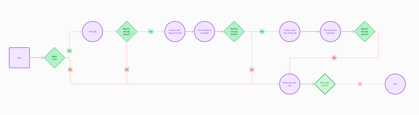
Some of the biggest issues with the video editor were centered around innefficent ways to splice footage accordingly. This meant that if a user wanted to remove an ‘um’ or a longer piece of footage for example, they would need to trim (grab the handles of the clip) to the cut point and then they would need to redrag that clip into the video timeline and then trim to the portion just after the edit. Speaking of timeline, there was no visual sense of a A-Z linear progression experience, which is fairly obtuse and not common within the video editing world
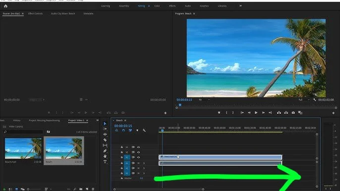
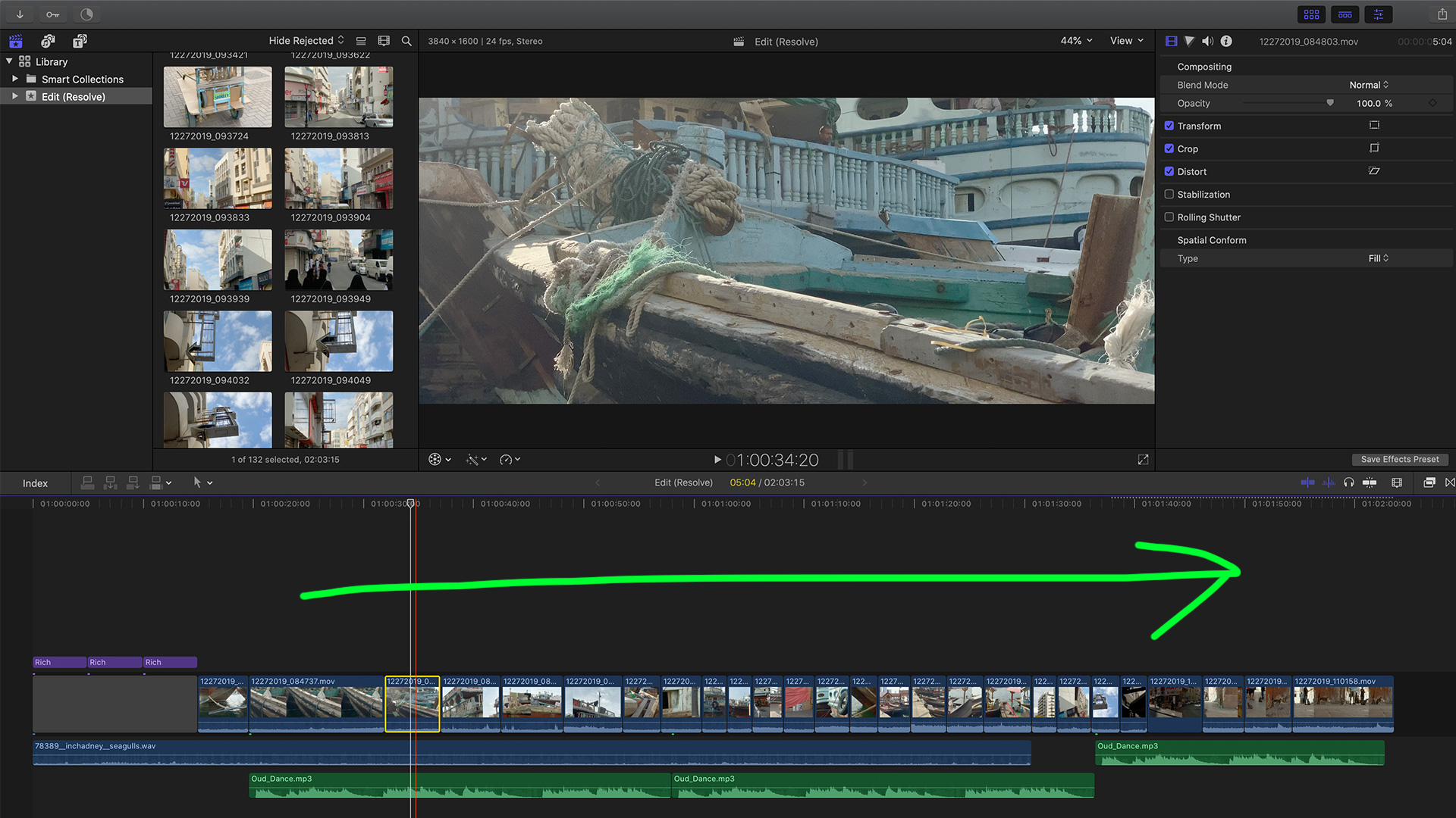
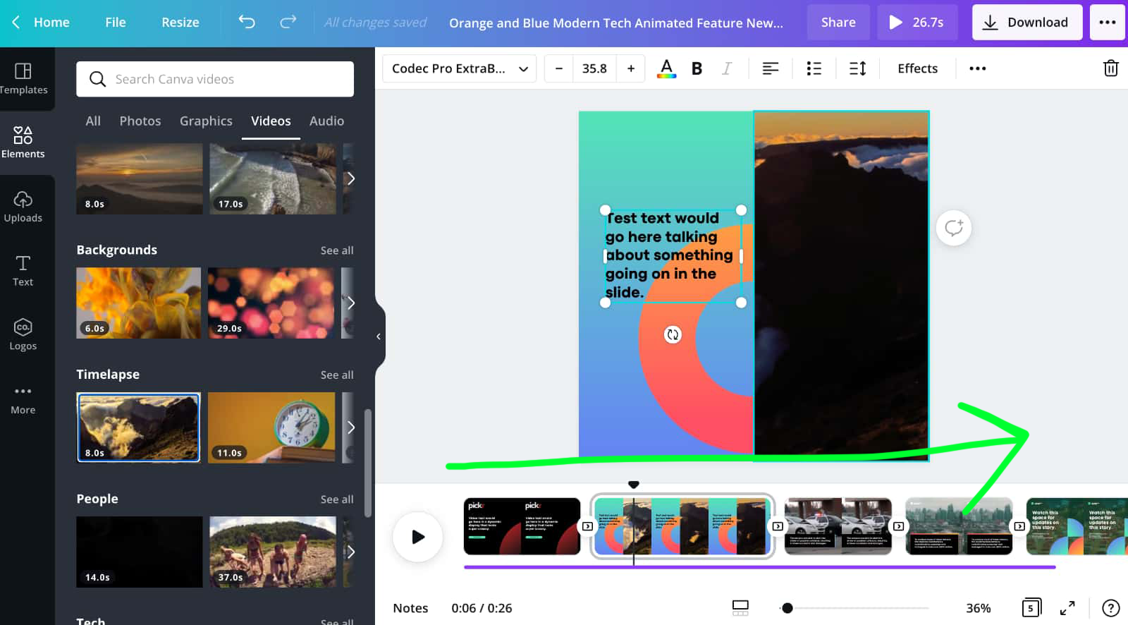
An important update was shifting the user experience towards a linear timeline, departing from the current simpler flow. Extensive secondary research was carried out to grasp the approaches to streamlined video editing. Since our user base had moderate video editing skills, our tool had to maintain a balance of simplicity in the editing process. This involved transitioning the interface from a professional tool to a more user-friendly design. Differentiating between Web and Desktop editing paradigms was crucial. For desktop editors, the workflow usually revolved around creating a 'Video Project' and then selecting media for editing, rather than directly editing a video. The distinction between video projects and individual videos in the library needed careful consideration. Analysis of platforms like Clipchamp, Vimeo, Tik Tok, Adobe Express, and Canva provided insight into web-based editing, while Premier Pro, DaVinci Resolve, and Final Cut Pro were studied for desktop editing. These explorations laid the groundwork for the evolving vision of our video editor.
Beta Demos and Customer Feedback
Weekly Demos involved actively showcasing our envisioned design solutions for the new video editor to our beta customers. Their valuable insights guided our iterative design process, ensuring alignment with real-world user needs. To validate our assumptions, we conducted rigorous Task-Based Assessments, observing users interact with the editor to gauge the practicality of our design solutions. Additionally, we regularly performed Internal Ad-Hoc Assessments with members from various teams to identify any early usability issues. Our commitment to usability extends beyond the initial launch, as we continue to test and evaluate the core feature set. Research brought for the important updates and changes such as templates and an updated linear experience.
Updated Video editor user journey flow
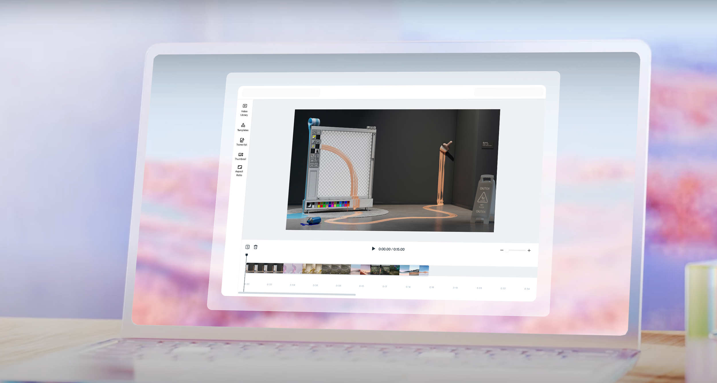
The further discussions and deconstruction of what a simple editing experience looked like was deciding on the nature of where the video editing experience might live. Previously a user would need to exit the video library to visit the playlists page, and from there could create videos. There were several discussions around perhaps we should rename Playlists to Video projects as a fi, where a user would create a new video project and then access their videos there. After some exploration and envisioning a further even simpler path, it was decided that rather than a place you needed to go to visit your videos, that editing became nest as a capability within each video. Every video is editable. You can lengthen, add more videos to it, or shorten it. No special place to go, always available. Intermediately there was the below concept in mind I created around lightweight video editing per video embedded as a capability rather than needing to create a special video type. Further iterations and evaluations highlighted the need for a more substantial solution for meeting the needs of accessing the full video library, things like templates, etc.
Concept lightweight editor ideas
The first screen shows a selected video state and the following what an improved more timeline centric experience might look like, aiding in evolving the tooling to a linear based experience.
Outcome
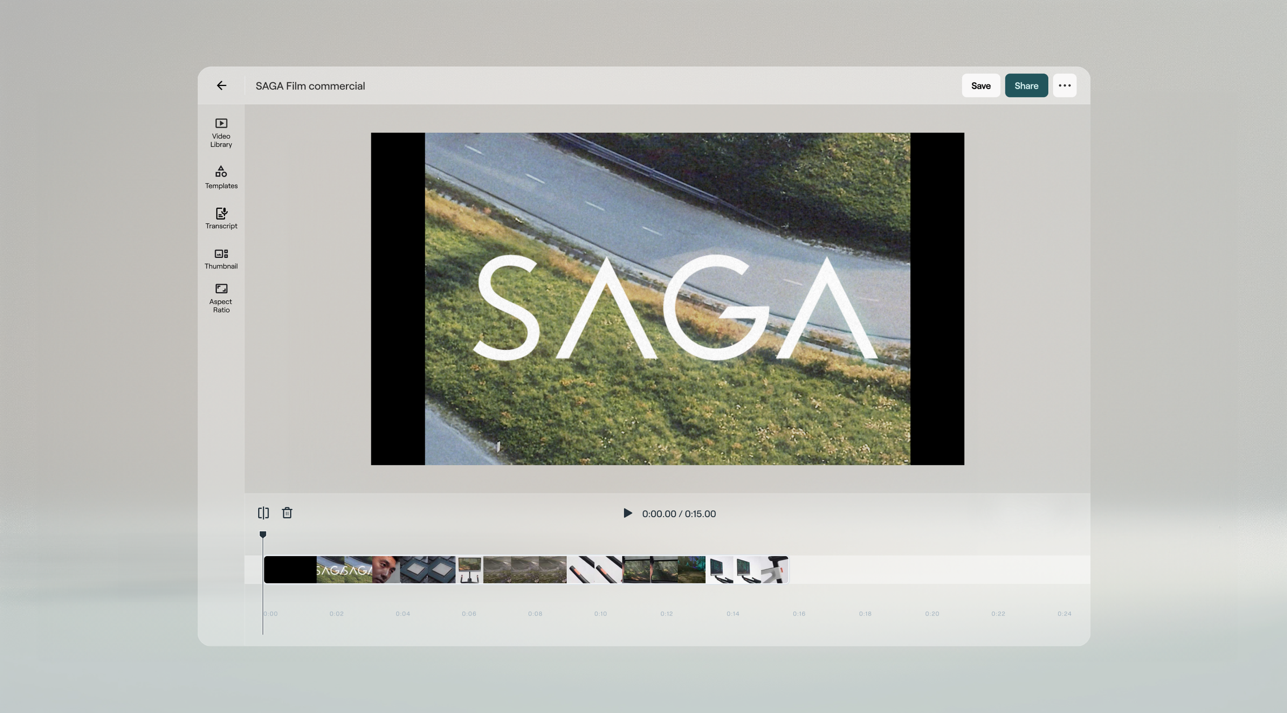
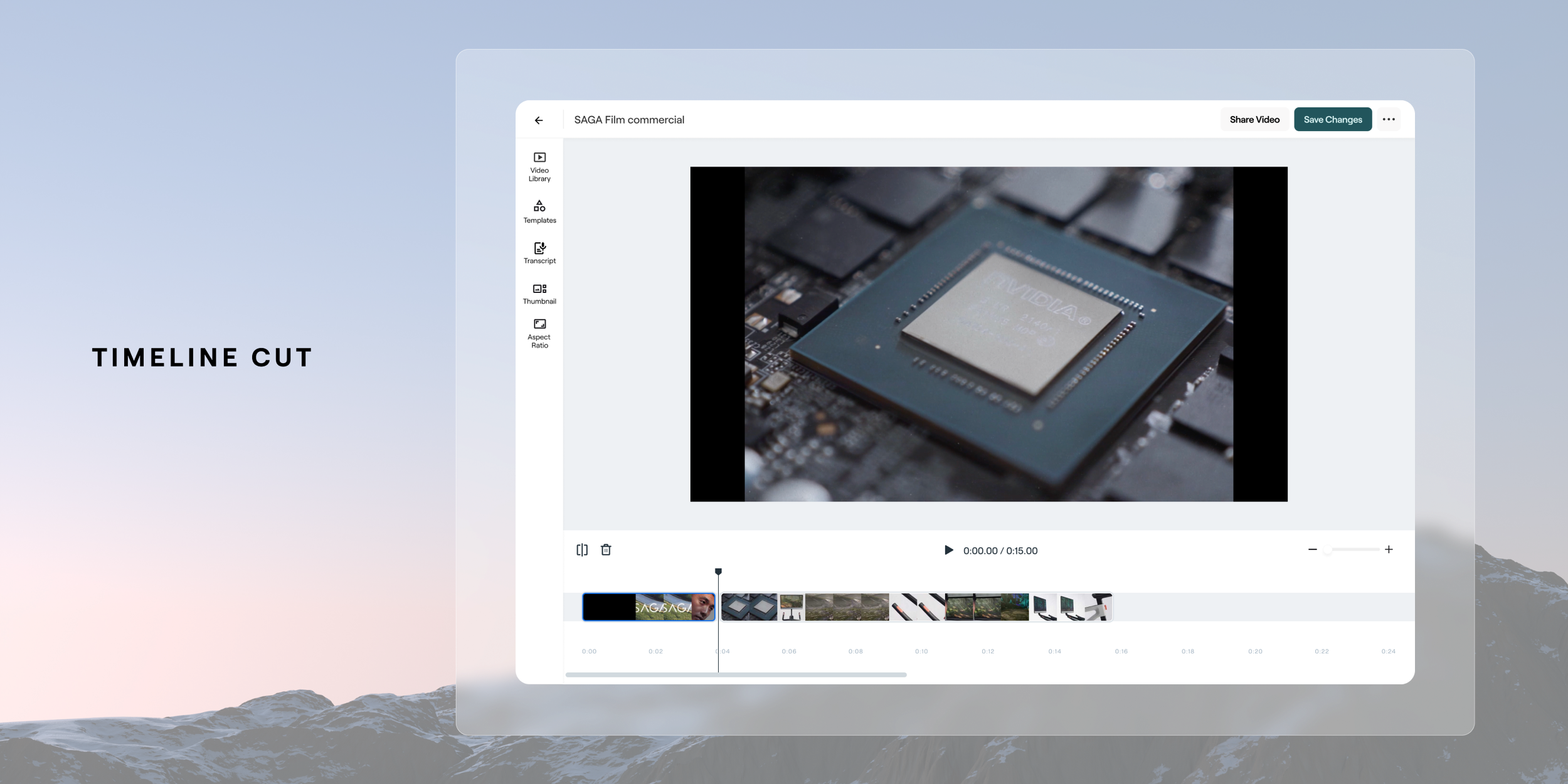
The design solution we landed on was based around ensuring the core capabilities of a complete video editor were in place for our users to manage their video timeline . To ensure we provided a stable transition for our users that were using the editor and through validation with customers that the current capability’s aligned to their needs we carried over the core functions that exist today. This improved linear method of editing ensured we stayed aligned to intuitive and common patterns for video creation. Below are some of the basic additions of splitting and deleting to manage the media on the timeline. An example of that baseline flow is below.


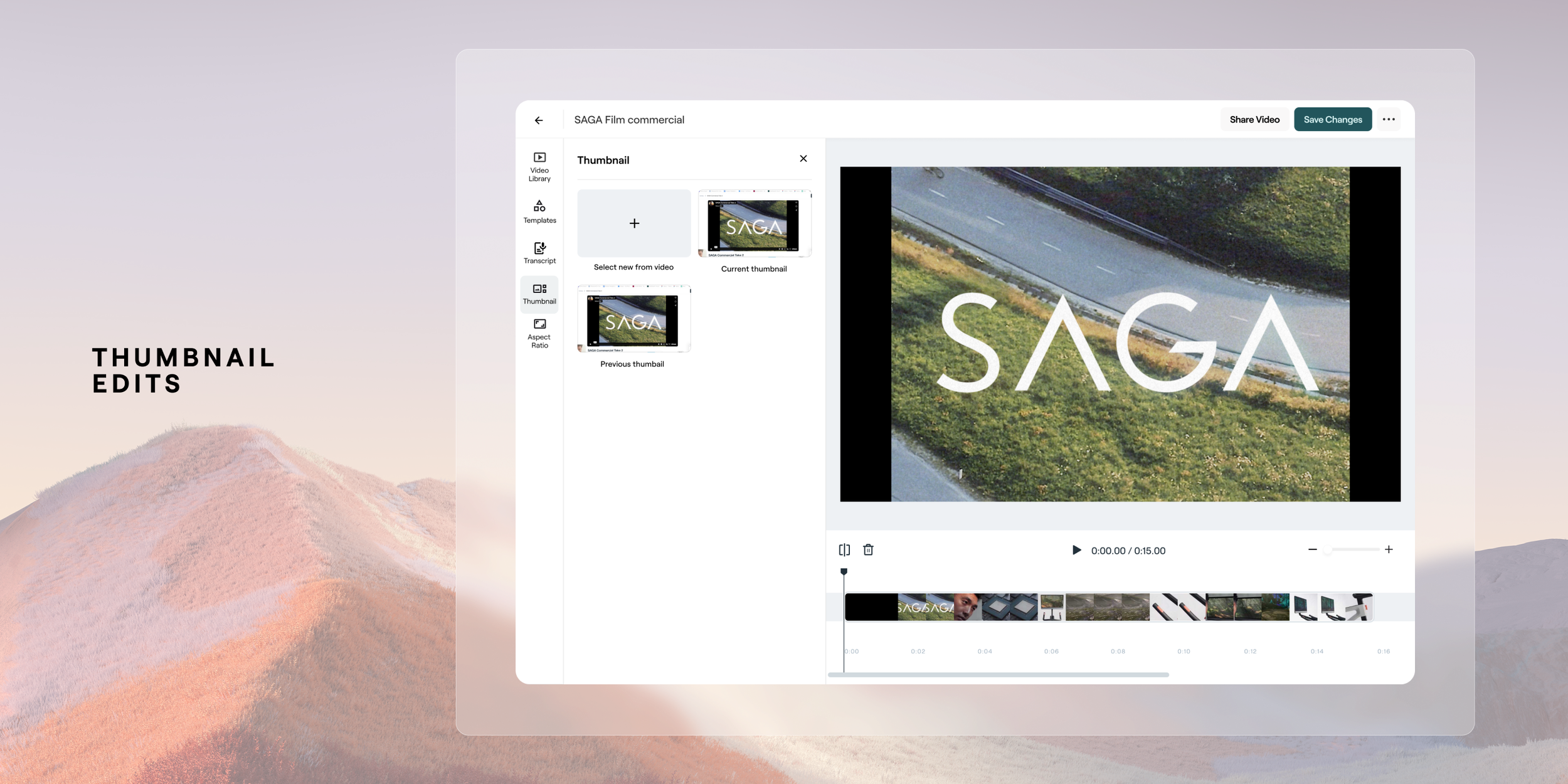
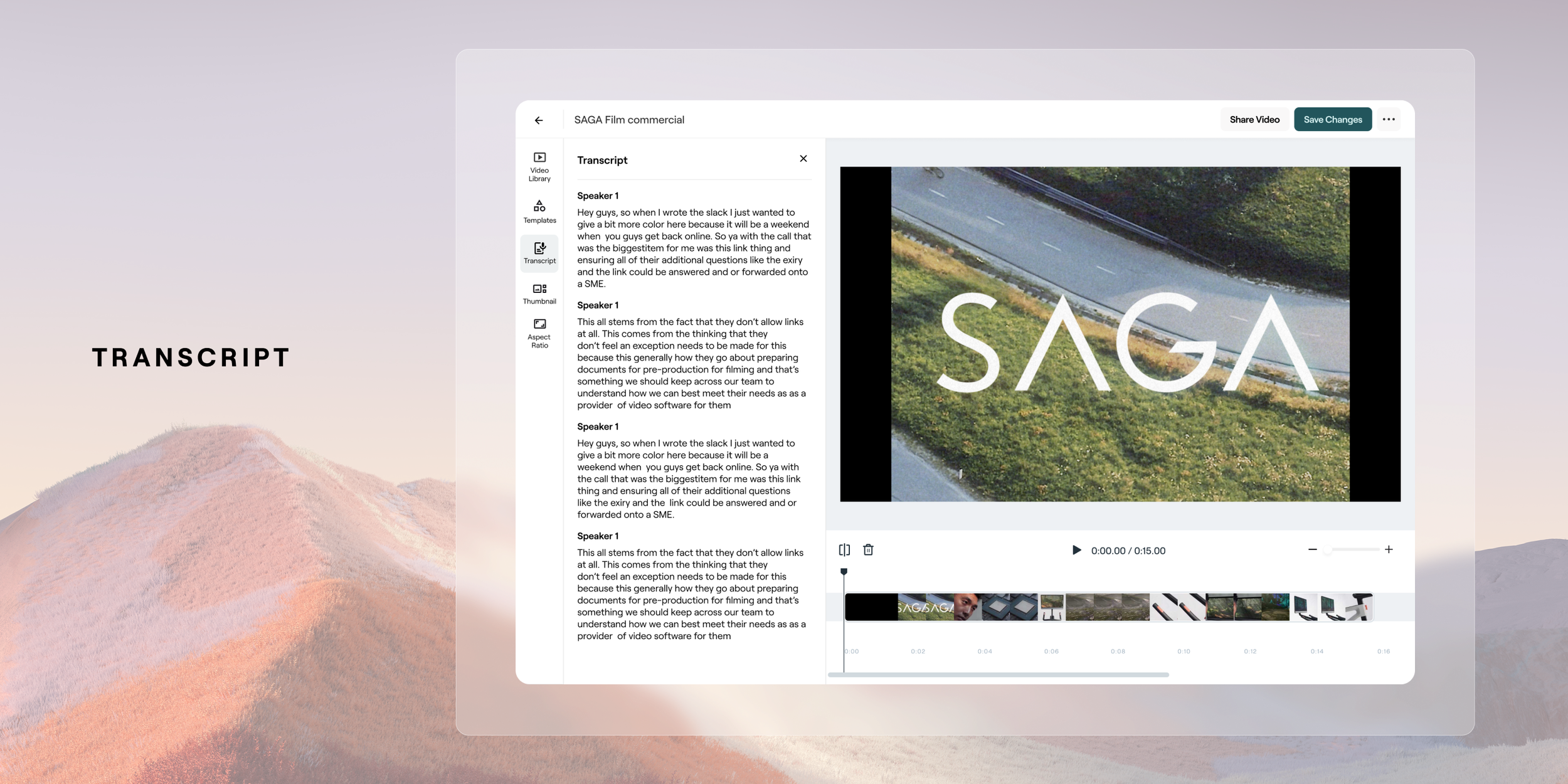
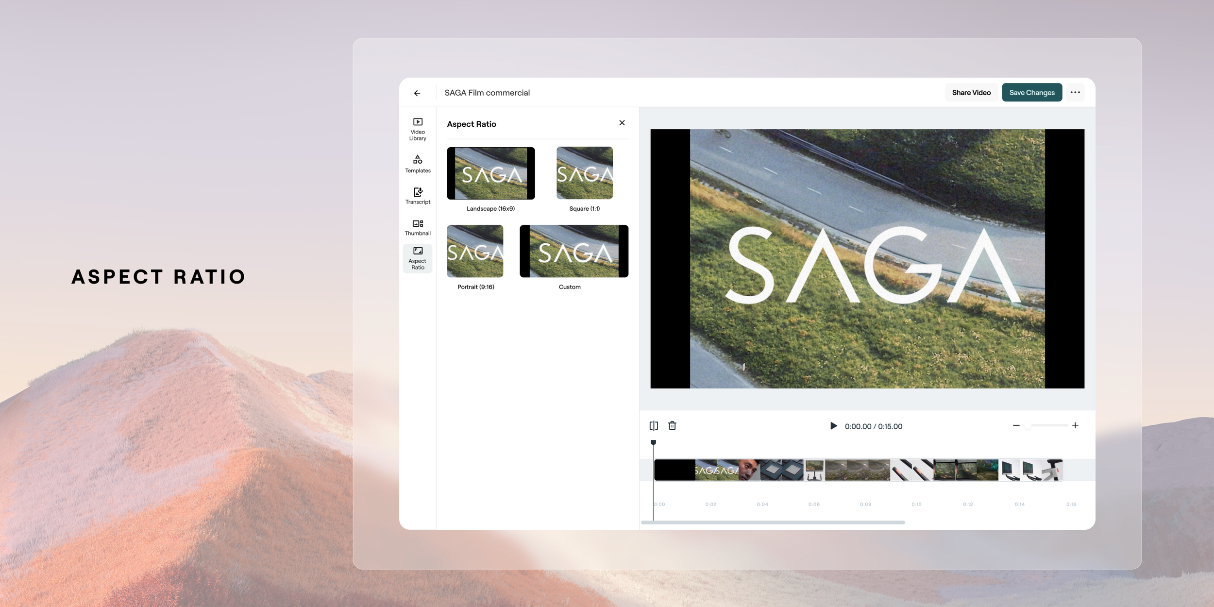
Video Library, Templates, Transcript + More
A thorough focus on being able to access your video library was put in place as a major add for users to easily access video library content, or to upload and request it. Also within here a user is ability to apply a set template which would enable a user to reapply repeatedly throughout their content. The other core features of being importance were the carry-over of the ability to edit by transcription, adjust your aspect ratio and thumbnail selection.


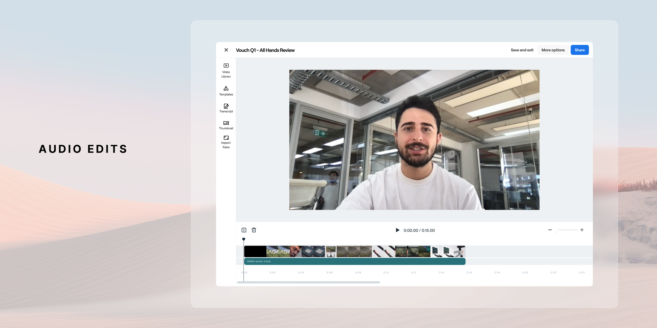
Future Development - Audio Editing
In the near future release we plan on adding an audio track layer to ensure that users have control over how they manage their audio. This is a pretty key feature to release as it’s very common to have control over the the video track and audio track to swap out elements of each. Eg, if you have a talking head shot, to swap for B roll. Below is the proposed design for this near future release. This new video editor it's a crucial step forward in enhancing our platform's video editing capabilities. It presents an exciting step forward in the capability of a platform to have a powerful and efficient video editor to give our users Through user-centric design and iterative improvements, the create compelling video content effortlessly and efficiently. This feature will continue to be fine tuned through continued iterative releases throughout 2024 and beyond as we receive feedback from users, optimize the user experience and grow the tool to meet their needs.
Conclusion
The revamped video editor at Vouch proved to be a resounding success, driving a remarkable increase in user adoption from 40% to 88%. The intuitive timeline-based interface, coupled with powerful editing features, transformed the user experience, making video creation and editing more accessible and efficient. This significant boost in usage not only underscores the project's positive impact on customer satisfaction but also highlights its effectiveness in empowering users to produce high-quality video content directly within the Vouch platform. The project's success reinforces the importance of user-centric design and validates the decision to invest in enhancing the platform's core capabilities.