Pulse - Human Centered Design Manufacturing
Summary
Aerospace Manufacturing represents a decades old practice of hard and true methods of building products. The vast assembly and intensive nature of installation requires an accurate base of knowledge that is both physical and digital. Pulse was meant to bridge these legacy methods into one human centered design application that could enable mechanics to efficiently and accurately build. A major element in the manufacturing ecosystem are 2 problems that Pulse was solving. There’s not visibility into the pace of production or problems until the next day. Job data isn't entered accurately in real-time. People can’t call for help from their work location and must travel to enter job progress into the system. At times, they wait for computers and enter at breaks or end of shift. As a result, we have a stale view of factory performance & work on yesterday’s problems. From the research specific capabilities were identified to be developed to help solve this Point of Use work instructions, Point of Use job buy-off, Track pace of production, TaktTime (Value Added Time), Respond to where Help is needed, See build progress closer to real-time, Reduce travel & traveled work, Optimize production & labor and Increase quality & safety.

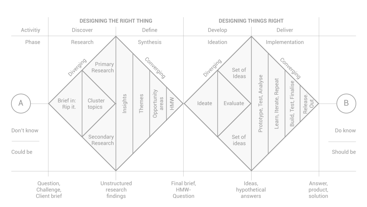
Sketch of opportunity space
My Role
I was the was a Senior Product Designer supporting a US based team of a Principal Designer, a Junior Designer to prototype out concepts to meet the capabilities that aligned to the Pulse Product Roadmap
Cross Functional Team Engagement
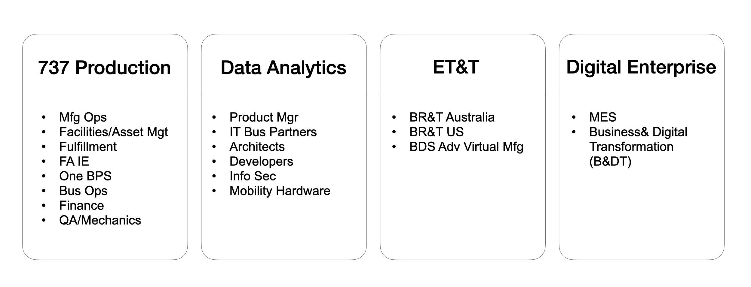
Our Product team identified through workshop events 4 major cross functional groups that were key to Pulse’s success. These included 737 Production, Data Analytics, Engineering Test Technology and the Digital Enterprise Core team.
The 737 Production team had members from Manufacturing Operations, Facilities and Asset Management, Fulfilment, Fabrication Industrial Engineering, One Boeing Production System (Supplier Management), Business Operations and Quality Insurance/Mechanics. These various parties provided context to their impact to the Airplane Production System and the various challenge and areas of opportunity that lay to help bridge the divide. The biggest focus being Mechanics and Quality Insurance who were at the tip of the spear of production.
Data Analytics included partners from Product Management, Information Technology Business Partners, Data Architects, Software Developers, Information Security and Mobility Hardware. These various teams provided their insight into the supporting systems and technical feasibility aspects needed to develop Pulse. This in turn helped identify the highest impact and lowest risk elements to begin prioritise into the outcome roadmap.
Engineering Test and Technology consisted of teams from Boeing Research & Technology Australia (where I’m attached) and the US and along with the Boeing Defence Space & Security (BDS) advanced virtual manufacturing teams. These teams provided their core set of resources across the software engineering functions to help initially validate and help integrate the application into the main Boeing production system.
The Digital Enterprise folks were comprised of the Manufacturing Execution System (MES) and the Business and Digital Transformation Team (B&DT). These were the core groups to buy off on the final decision gate the integration of Pulse Boeing enterprise wide. They provided their core requirements and the direct outcome of what a successful version of Pulse looks like.
User Research
The User Research team conducted an in depth Discovery & Framing approach to understand the multiple avenues of impact that Pulse could take on. During the initial discovery phase, 40+ interviews were conducted with the manufacturing teams comprising of mechanics and quality assurance inspectors. The goal of this contextual inquiry, was to get an inner working and understanding of the current work flow and eco system to their standard work. A service blueprint map was drawn up to start developing a user journey that highlights a users emotional engagement with manufacturing applications from initial start to ending, touch points, and back end system architecture.
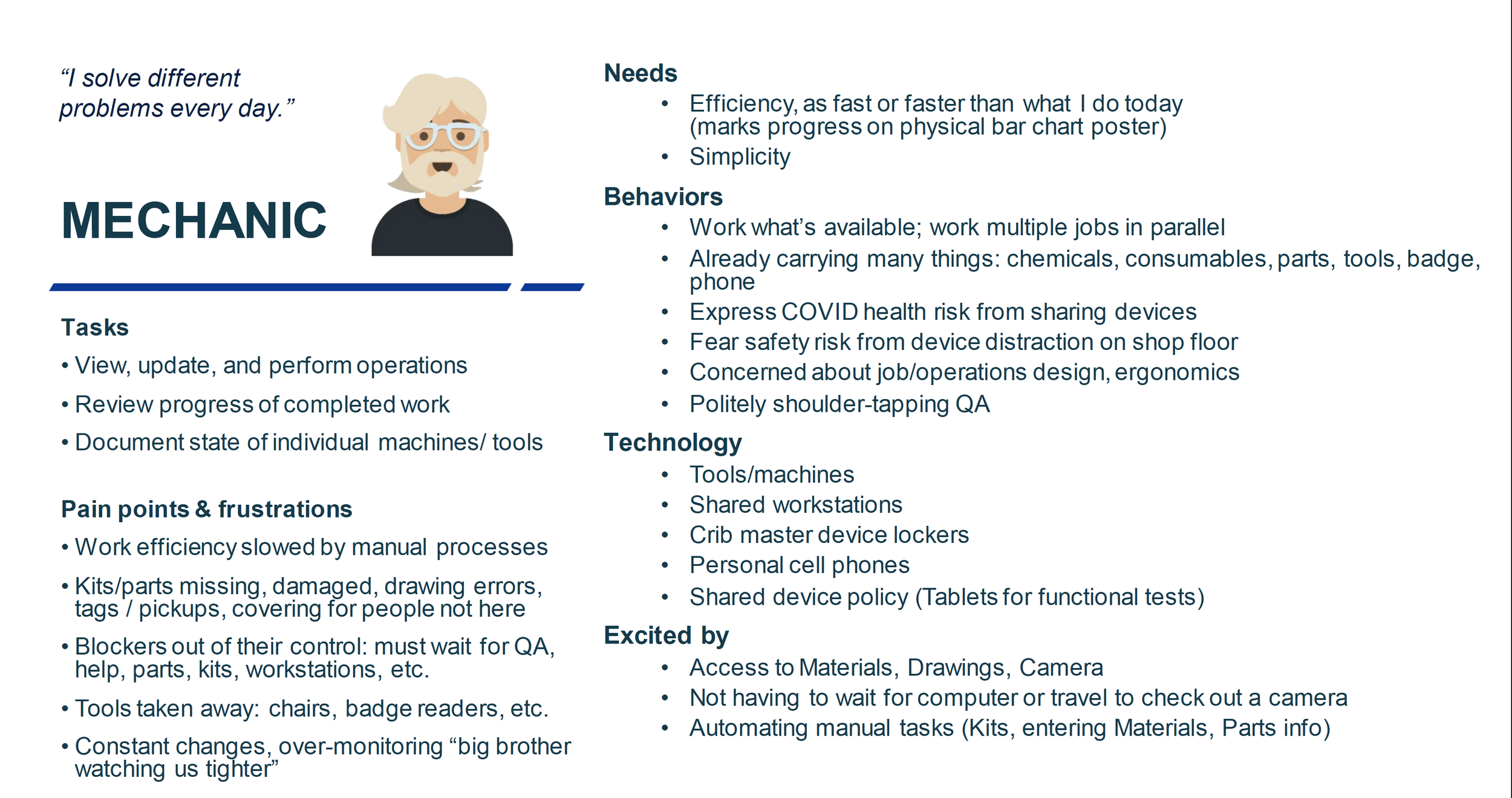
From that activity assumption gathering began where the team started identifying and documenting hypothesis we had about users needs and wants. User Personas were also archetypes to tangibly identify the tasks, pain points and frustrations, needs, behaviours, technology and areas of excitement to help tangibly map some areas of opportunity. A user journey map was also created to digitise what the future ideal experience might look like.
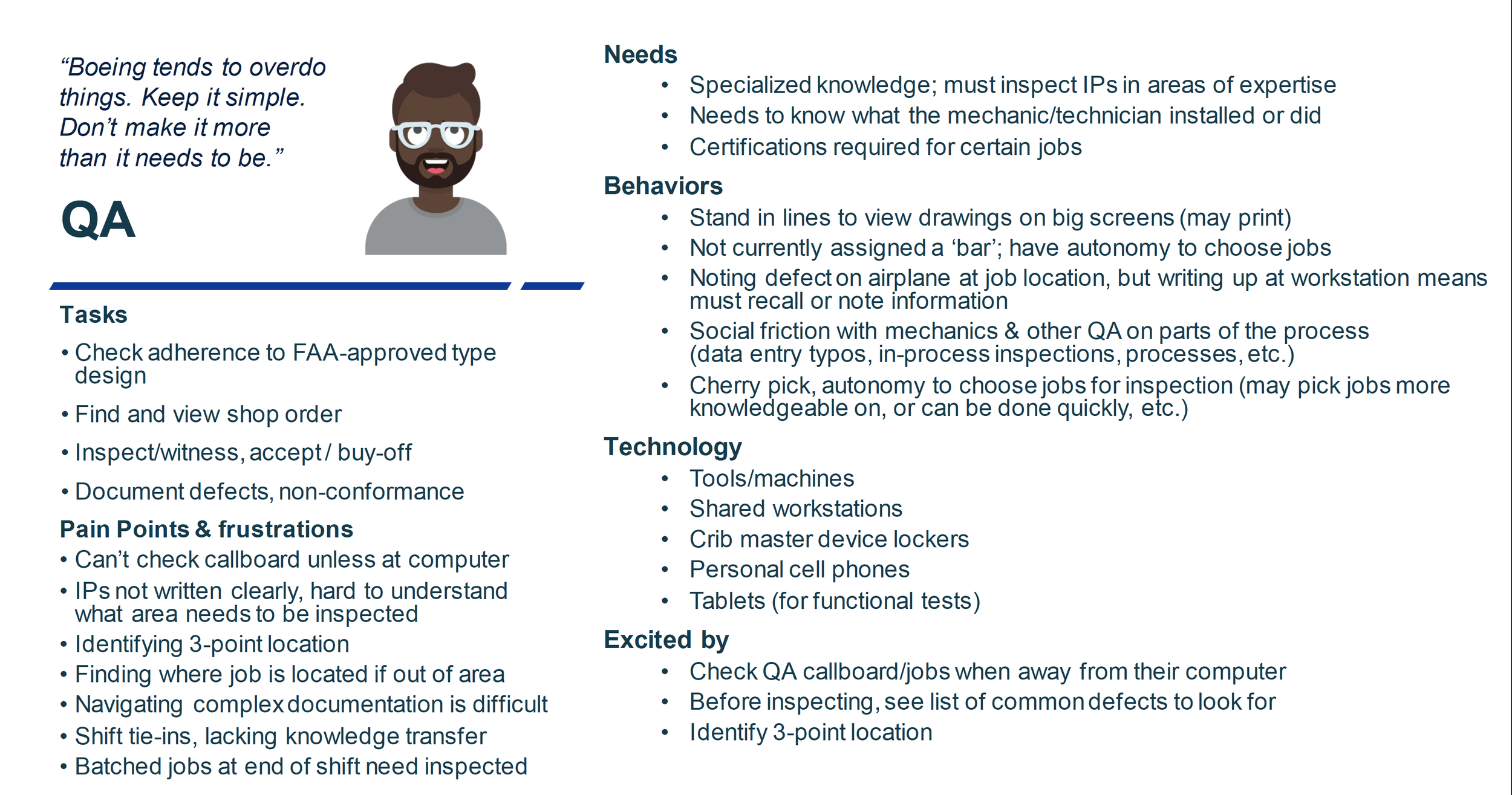
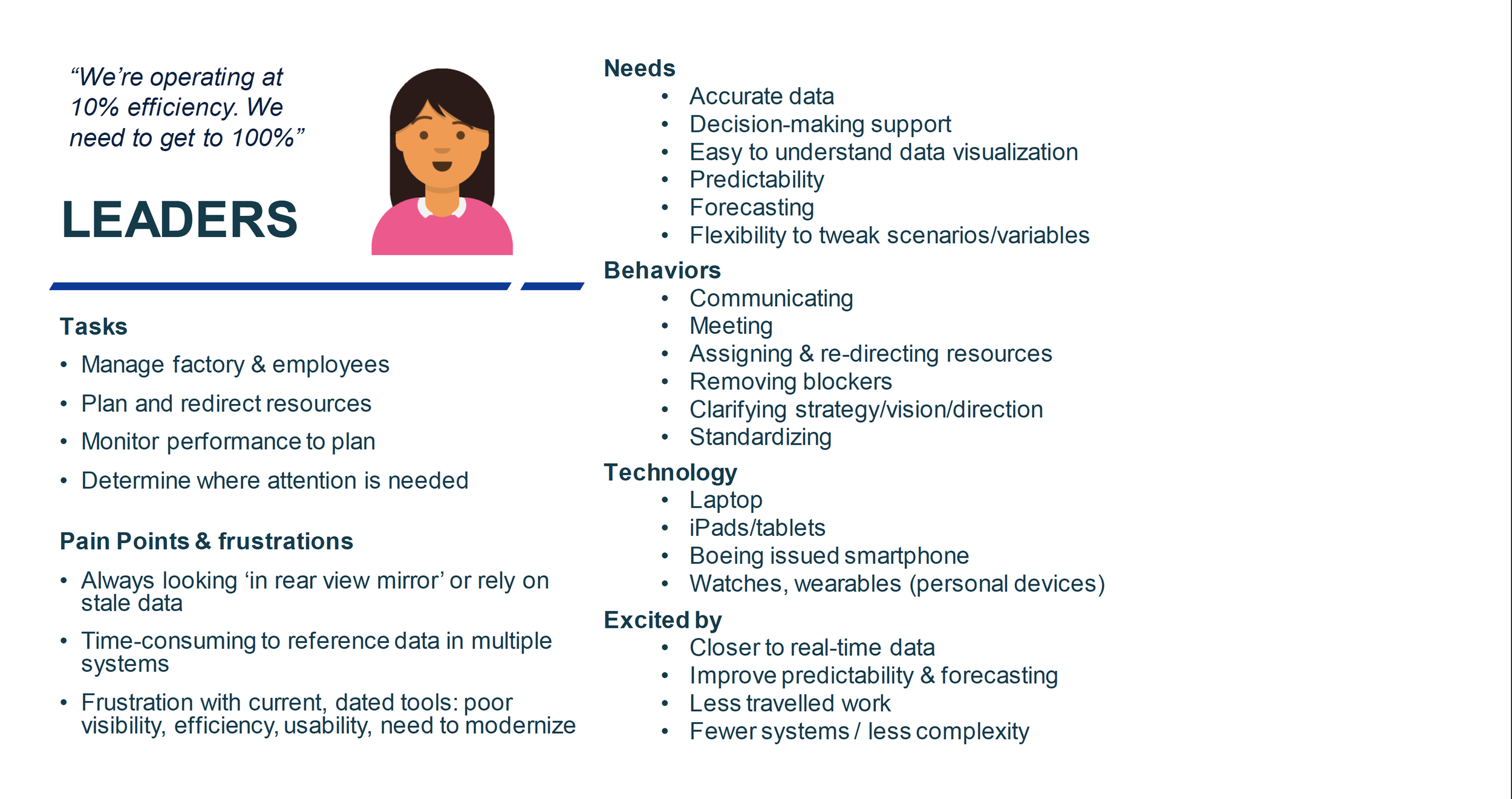
User Personas
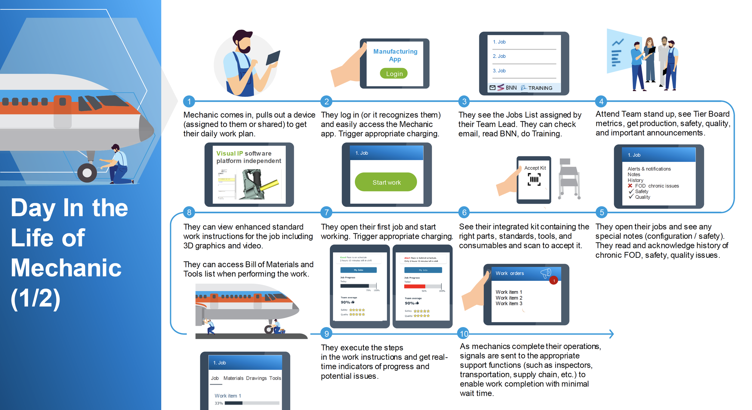
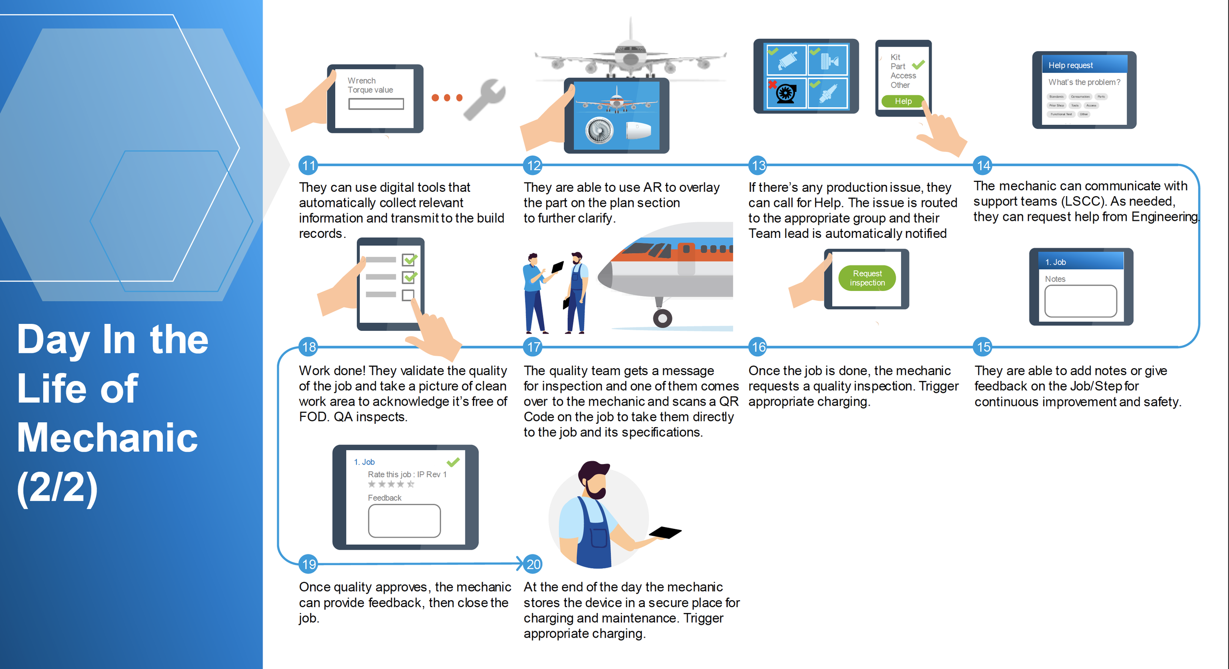
User Journey Map
MVP - Starting Work/Completing Individual Steps
From an extensive Risk/Impact Generation workshop where the highest impact, low risk and vice versa actions the product team can take on, a final down selection was chosen. The first experience to be developed would the core experience of Starting Work and Completing Installation steps. This experience would focus around the Mechanics and Quality Assurance Inspectors daily statement of work. This meant finding the right interaction method to showcase how to individually launch a job. The tertiary action was for a Mechanic or Quality Assurance inspector to stamp off operational steps within an installation plan.
Build, Measure, Learn
As we launched into prototype creation and ideation, design studios and weekly sprint and technical feasibility discussions were drawn into the design cadence. This ensured a right sized approach at an apt technical cost if there were a more efficient or lean process. This being extremely valuable before implementing into a wireframe and especially if validated by users to see where it stacked on scope creep, before going into development. This close relationship help keep the continous validation and integration cadence at a comfortable pace. The design reviews below were prototyped amongst this regular cadence and software engineering perspectives along with the product side were brought into the discussion to form and meld what is shown below.
Responsive Design
It was highly important to consider responsive design in all projects and especially Pulse. This will help accomodate various monitor and viewport and prevenitng excessive scrolling. Documentation both internally and externally was reviewed to ensure a solid baseline grid system. The end goal being a device agnostic experience that would snap to various screen sizes. This meant testing on the most common devices utilised in production. Initially the Samsung S8 was the first go-to device chosen for Pulse, hence the original design. However the induction of Apple and iOS devices changed the direction of the Product Design to include that device.
Design Studios
An insightful part of the design process for the progression of BSI considering its engineering complexity were proactively running studio sessions with various cross functional partners and users. There was an important focus on psychological safety to ensure everyone felt validated and heard. They were set up monthly sessions where they could share their perspectives from the hats of technical feasibility (development perspective), user practicality (mechanics/quality assurance), viability (product teams) and usability (with other designers). These valuable sessions were setup in an agile way to be in 30 minute sessions to be accommodating of everyones time in a fast paced 8 hour shift day. They were setup in a way to start with a '“How Might We” question focusing on what capability we might design to provide the solution to an outcome we’re trying to solve. 2 x 15 minute sketch sessions were practised where everyone could either describe or draw their ideas out (whilst a good ambient Spotify playlist was playing). Afterwards I would collect those artefacts, digitise them and reference them during the wireframe creations to understand intent and right size my design approaches.
Material Design

Accessibility Considerations
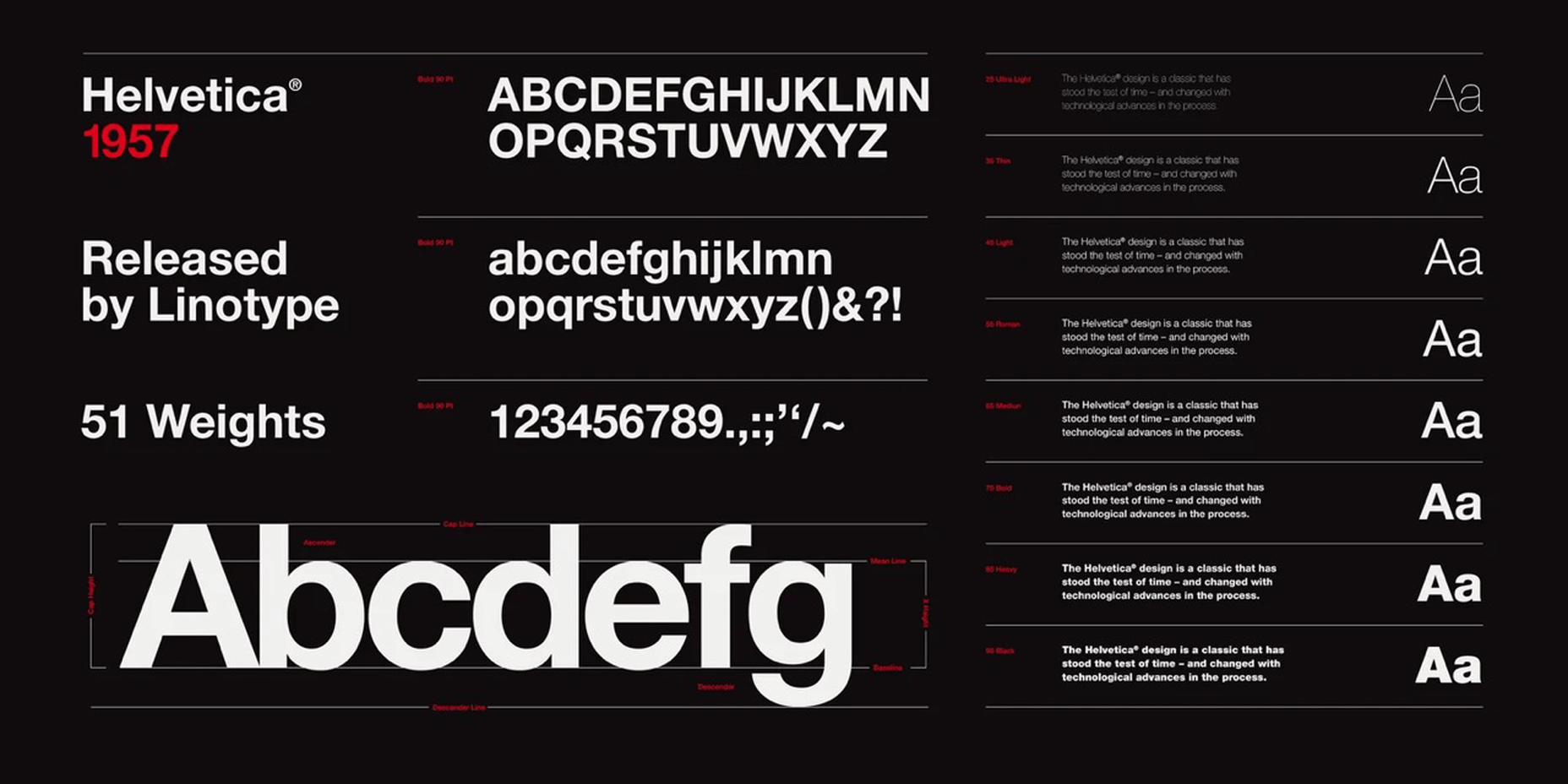
As Pulse developed further and iterative usability sessions were conducted it was important to look at the adherence to Accessibility standards. Currently, Section 508 of the Rehabilitation Act of 1973 does not specify the requirements for choosing an accessible typeface. However, the US Department of Health & Human Services unofficially recommends the following fonts for PDF files: Times New Roman, Verdana, Arial, Tahoma, Helvetica, and Calibri. Helvetica was officially down selected as the font choice and a typography standard was finalised and all designs were reviewed to ensure they aligned to this standard,
Initial Design
At the start being closest to the User Research near the Factory, the US design team had sprinted ahead and created their initial prototype for the Samsung S8 using a mix of interaction patterns and concepts before I became the designated Prototyping lead. The below was their first iteration.
Initial Concept Usability
Several iterative usability sessions were conducted to understand the effectiveness of the wireframe concept to see if it had designed enough of the capabilities into the experience. Interview scripts were utilised to ensure a commonality across the experience with crafted bias free language and a non guided approach. The user feedback was that general flow of starting at a launch point and starting work aligned to the journey flow they were expecting and that it was a major step forward. However - the bespoke nature of some of the User Experience components and behaviours made it challenging to interpret what the interaction next step might be. Furthermore a vertical scroll heavy experience would make it challenging with larger installation plan jobs with dozens of operational steps, thus a new interaction design would need to be considered.
Updated Design
I reflected on the usability notes and considered on what changes might be incorporated to simplify the experience and find more commonality across the interaction patterns. Additionally with an update to devices to iOS the design needed to reflect those hardware changes. Earlier - a variety of internal Boeing design systems had been referenced and the assortment of components were implemented into the design, making the experience feel fragmented. I received buy in from the US team to use a single design system to ensure a familiar pattern and look and feel and referenced Material Design for its researched and well documented interactions. Below is the updated design I created.
Usability Feedback
This was tested with mechanics and quality inspectors who liked the updated simplicity to start work and to work through operational steps. The design was also more aligned to our Design System and made it easier from the implementation development standpoint to pull those component libraries and standard interaction patterns. Transitioning the design from a vertical scroll to horizontal experience also optimised the viewport to be agnostic across devices being utilized with manufacturing teams. There were some incremental updates of interest, such accessing the additional page content from a dropdown to tabs for easier discoverability which were implemented over the course of the roadmap. There also was an interest in a future dark mode state with considerations to accessibility and also research into a more accessible text sizes.
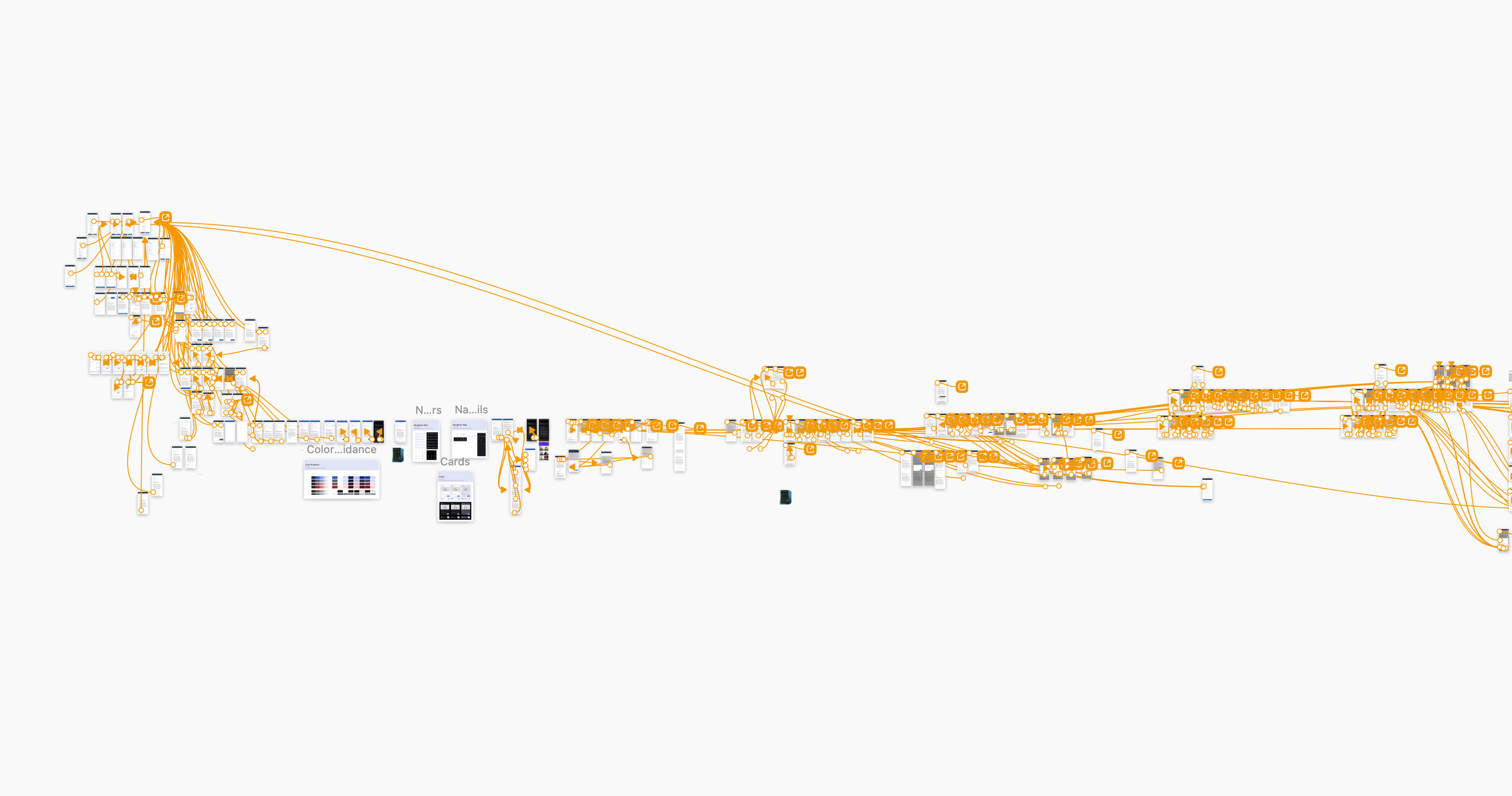
Iterative Design Approach

Next Milestone - Help Needed
A major challenge on the factory were delays to production due to interruptions, rework or incorrect parts in their kits. This resulted in them being held until they could have the interruption be sorted (usually a travelled work mechanic completing a previous job or another mechanic in the critical path build sequence also being held). This made it difficult to accurately track installation plan time and as production flows and new sequences came into the production system (eg, increased production) . Thus this was the next major milestone on the roadmap generated from the risk/impact generation activity and Outcome roadmap
Help Needed - Initial Prototype
I gathered contextual notes and created user journey flow artefacts to begun designing a prototype that could fit and incorporate those elements into a design solution. The main challenges would be around leanly down selecting information and data entry points that normally encompass several extensive screens on a desktop. The main things a mechanic would need: down selecting what their issue is, then selecting the specific parts that they needed help with (eg kit shortage) and then submitting that request. I created a 2 step process and utilised a variety methods such as a carousal based design to optimise screen real estate. The first version is below..
Usability Feedback
Usability rounds were conducted to test and evaluate the various capabilities built into the prototype. Overall the feedback was positive around the general flow and ability to smoothing sort and select the various data inputs. There was a consistent theme around a preference for a more hybrid vertical and horizontal experience than a heavy focus on either interaction pattern. Some additional capabilities were needing to be explored such as taking a photo were further discovered. There was also an interest in clarifying the steps were intended to be 3 rather than 2. All of these learns went into the next round of prototype.
Help Needed Update
This final format tested really well with users who were able to utilize both the slide up capability and horizontal scroll as needed. The enhanced and broadened UI space from not needing to crop for the browser experience also helped gain the additional real estate to optimise the user experience.
Research Guided Design
The core design was narrowed down based from usability after the main concept was drawn out and design studios iteratively conducted to understand best layout. 6-8 users composed of the direct or tertiary shadow users were tested to understand intuitiveness and how it stacked against the core heuristics. Feedback was around keeping visuals lean and providing intuitive ways of discovering and utilising information such as through horizontal and vertical card patterns. Research provided proper guidance on the best visuals, benchmarking against industry standards and providing the nuanced manufacturing information that would be relevant to gain insights. This shows the design evolution from broad to narrow with bi-monthly usability studies and stakeholder reviews to showcase progress and document learnings. The core design layout being narrowed in on show in the final visual of vertical layout with horizontal controls.
Dev/Design Pairing
As Pulse reached its launch, regular implementation sessions were standardised to ensure the designs weren’t introducing beyond scope technical debt and also to help pixel perfection. This meant ensuring complete alignment to Material Design standards and to also evaluate its evolution. At the start of pulse, Material Design 2 was the referenced system, however towards the latter end of the initial MVP Material 3 had been launched. This evolved design had through research updated its design standards to simplify and also iterate the look and feel of common components. As a result when opportunity arose those elements were incorporated into the Pulse Design.
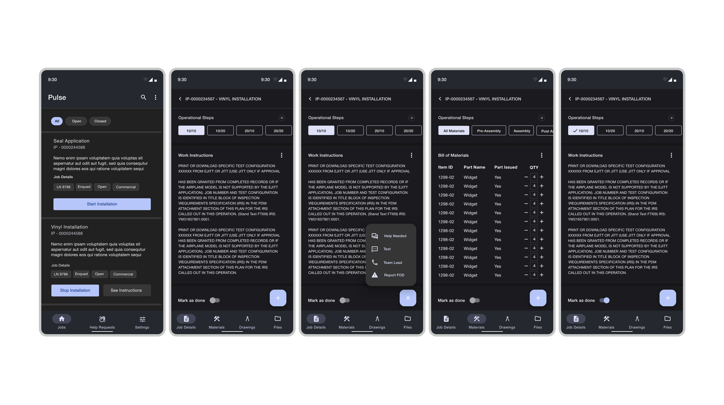
Shipped Core Product Design
The core Product Design was finalised to be the below User Experience. The default mode established from users was that a dark mode was optimal considering the darker environments of manufacturing environments and made it more ergonomic to interact with over time. The design also implemented such evolved Material 3 elements such as the emphasis from rounded off chips to more soft bevel designs and update to Floating Action Buttons to also reflect this evolution.
Outcome
Pulse is now being utilised and rolled out into the Airplane Production ecosystem and gradually rolled out across the wide array of products Boeing builds. Pulse has enabled Manufacturing teams to be more mobile and have more value added time onto the airplane they are building with a user centered design approach to incrementally add updates.. In the next iteration the focus is development of a desktop versioning of Pulse and also of Call Boards where teams can see and track progress and block points. The data ingested has also helped the manufacturing engineering teams to update and provide more agile methods across jobs to optimise production builds and find the fastest time across the critical path build sequence.